Transitions
The CSS transition property allows you to smoothly animate changes between styles over a given period of time. Instead of instantly jumping from one style to another, transitions create a gradual effect, making web elements more interactive and visually appealing.
Syntax:
transition: property duration timing-function delay;- property → the CSS property you want to animate (
width,height,color, etc.). Useallto apply transitions to all animatable properties. - duration → how long the transition takes (e.g.,
2s,500ms). - timing-function → how the transition progresses over time (
ease,linear,ease-in,ease-out,ease-in-out, or customcubic-bezier). - delay → wait before the transition starts.
1. Basic Transition (on all properties)
Here’s an example where the box smoothly changes its width, height, and background color on hover.
<!DOCTYPE html>
<html lang="en">
<head>
<meta charset="UTF-8">
<title>CSS Transition Example</title>
<style>
body { text-align: center; font-family: Arial; }
.box {
width: 150px;
height: 150px;
margin: 50px auto;
background: lightblue;
border: 2px solid navy;
transition: all 2s;
}
.box:hover {
width: 200px;
height: 200px;
background: coral;
}
</style>
</head>
<body>
<h2>Basic CSS Transition</h2>
<div class="box"></div>
<p>Hover the box to see it grow in size and change color <b>smoothly</b> over 2 seconds.</p>
</body>
</html>Output:
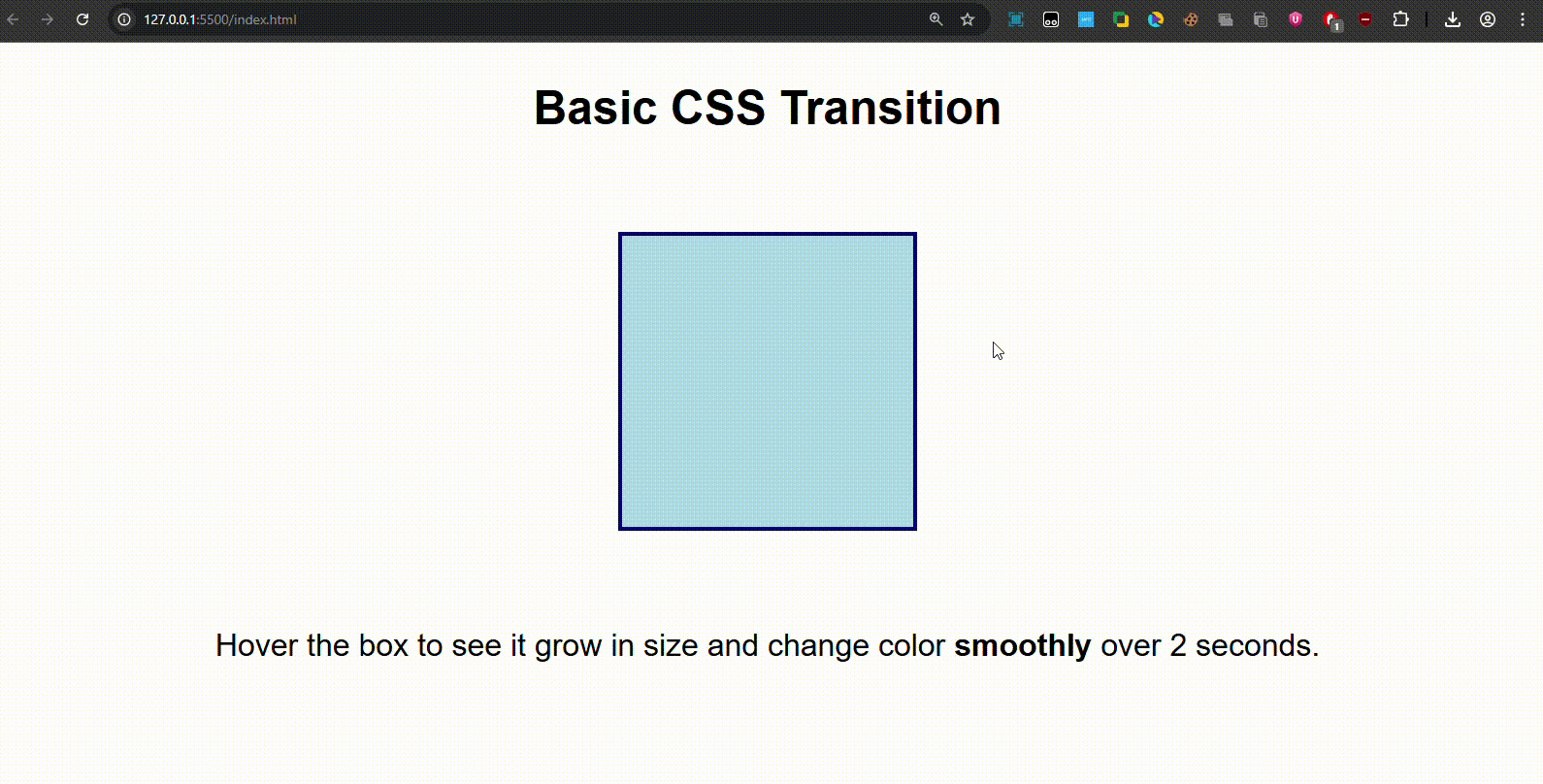
On hover, the box enlarges and changes color gradually in 2 seconds.
2. Transitioning a Single Property
You can apply transitions only to a specific property. For example, only width should animate while color changes instantly.
<!DOCTYPE html>
<html lang="en">
<head>
<meta charset="UTF-8">
<title>CSS Transition Single Property</title>
<style>
body { text-align: center; font-family: Arial; }
.box {
width: 150px;
height: 150px;
margin: 50px auto;
background: lightgreen;
border: 2px solid darkgreen;
transition: width 3s;
}
.box:hover {
width: 300px;
background: tomato; /* this changes instantly */
}
</style>
</head>
<body>
<h2>Transition on a Single Property</h2>
<div class="box"></div>
<p>Hover the box → only <b>width expands gradually</b> in 3s, color changes instantly.</p>
</body>
</html>Output:
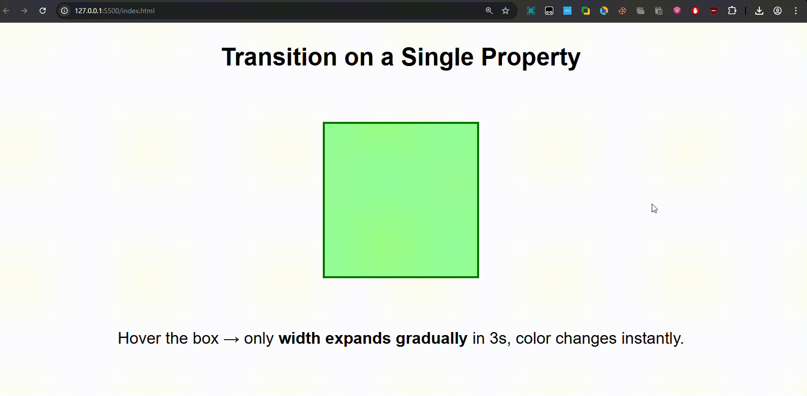
Width expands smoothly, background color changes instantly.
3. Transition Timing Functions
The timing-function controls the speed curve of the transition:
linear→ same speed from start to end.ease→ default, starts slow → speeds up → slows down.ease-in→ slow at start.ease-out→ slow at end.ease-in-out→ slow at start and end.
<!DOCTYPE html>
<html lang="en">
<head>
<meta charset="UTF-8">
<title>CSS Transition Timing</title>
<style>
body { text-align: center; font-family: Arial; }
.container { display: flex; justify-content: center; gap: 20px; }
.box {
width: 80px; height: 80px;
background: skyblue;
border: 2px solid navy;
transition: width 2s;
}
.linear:hover { transition-timing-function: linear; width: 200px; }
.ease:hover { transition-timing-function: ease; width: 200px; }
.ease-in:hover { transition-timing-function: ease-in; width: 200px; }
.ease-out:hover { transition-timing-function: ease-out; width: 200px; }
.ease-in-out:hover { transition-timing-function: ease-in-out; width: 200px; }
</style>
</head>
<body>
<h2>CSS Transition Timing Functions</h2>
<div class="container">
<div class="box linear">linear</div>
<div class="box ease">ease</div>
<div class="box ease-in">ease-in</div>
<div class="box ease-out">ease-out</div>
<div class="box ease-in-out">ease-in-out</div>
</div>
<p>Hover each box to see how speed changes differently depending on the timing function.</p>
</body>
</html>Output:
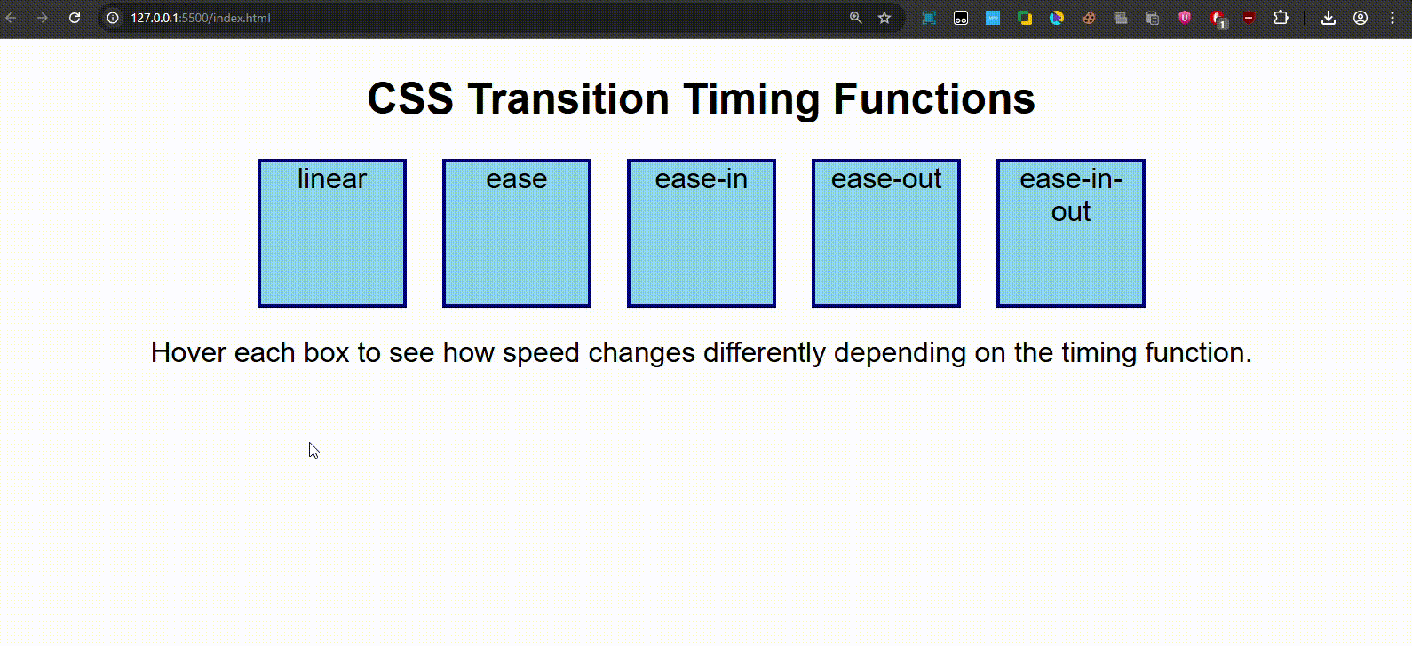
Each box expands differently (some start slow, some end slow).
4. Transition with Delay
You can also delay when a transition starts.
<!DOCTYPE html>
<html lang="en">
<head>
<meta charset="UTF-8">
<title>CSS Transition Delay</title>
<style>
body { text-align: center; font-family: Arial; }
.box {
width: 150px;
height: 150px;
margin: 50px auto;
background: lightpink;
border: 2px solid crimson;
transition: width 2s ease-in-out 1s;
}
.box:hover {
width: 300px;
}
</style>
</head>
<body>
<h2>Transition with Delay</h2>
<div class="box"></div>
<p>Hover the box → transition <b>waits 1s</b> before starting, then expands smoothly.</p>
</body>
</html>Output:
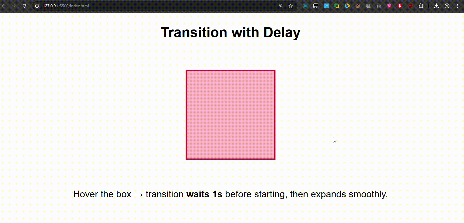
On hover, nothing happens for 1 second, then the box expands.
Quick Recap-
-
transitionmakes property changes smooth. -
You can control:
- duration (
2s,500ms) - timing function (
ease,linear, etc.) - delay (
1sbefore starting)
- duration (
-
Works best with hover effects, buttons, and interactive UI elements.