Gradients
Gradients in CSS allow you to blend two or more colors smoothly. Instead of using a plain solid background color, you can create visually appealing transitions. CSS supports three main types of gradients:
- Linear Gradients
- Radial Gradients
- Conic Gradients
Each type has its own unique behavior and use cases. Let’s explore them one by one with examples.
1. Linear Gradient
A linear gradient creates a smooth transition of colors along a straight line (horizontal, vertical, or diagonal).
Syntax:
background-image: linear-gradient(direction, color1, color2, ...);
- direction → defines the gradient angle (e.g., to right, 90deg, etc.).
- color stops → define colors (and optional percentages).
Example:
<!DOCTYPE html>
<html lang="en">
<head>
  <meta charset="UTF-8">
  <title>CSS Linear Gradient</title>
  <style>
    body {
      font-family: Arial, sans-serif;
      text-align: center;
      padding: 50px;
    }
    .linear-gradient-box {
      width: 400px;
      height: 200px;
      margin: auto;
      border: 2px solid #333;
      background-image: linear-gradient(100deg, blue, orange, red);
    }
  </style>
</head>
<body>
  <h2>Linear Gradient Example</h2>
  <div class="linear-gradient-box"></div>
  <p>The gradient flows diagonally at 100 degrees, blending blue → orange → red.</p>
</body>
</html>
Output:
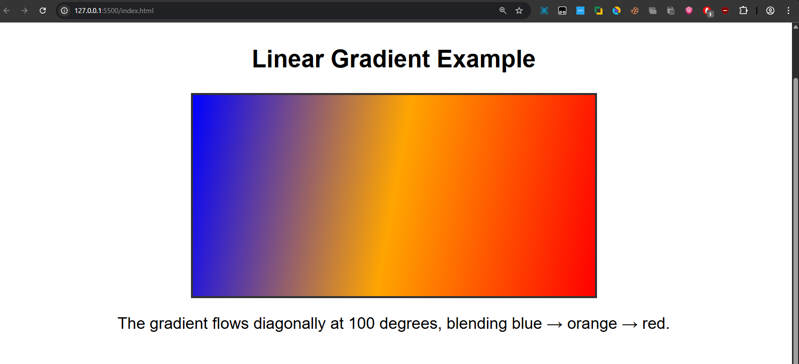
A box filled with a diagonal gradient from blue → orange → red.
2. Radial Gradient
The gradient here is added from the center focal point. The color added first marks the center of the gradient and keeps expanding circularly.
Syntax:
background-image: radial-gradient(shape size at position, color1, color2, ...);- shape → circle or ellipse (default is ellipse).
- size → closest-side, farthest-corner, etc.
- position → location of the gradient center (default: center).
Example:
<!DOCTYPE html>
<html lang="en">
<head>
  <meta charset="UTF-8">
  <title>CSS Radial Gradient</title>
  <style>
    body {
      font-family: Arial, sans-serif;
      text-align: center;
      padding: 50px;
    }
    .radial-gradient-box {
      width: 400px;
      height: 200px;
      margin: auto;
      border: 2px solid #333;
      background-image: radial-gradient(circle, blue 20%, orange, red);
    }
  </style>
</head>
<body>
  <h2>Radial Gradient Example</h2>
  <div class="radial-gradient-box"></div>
  <p>The gradient starts with <b>blue (20%)</b> at the center, then blends to <b>orange → red</b>.</p>
</body>
</html>
Output:
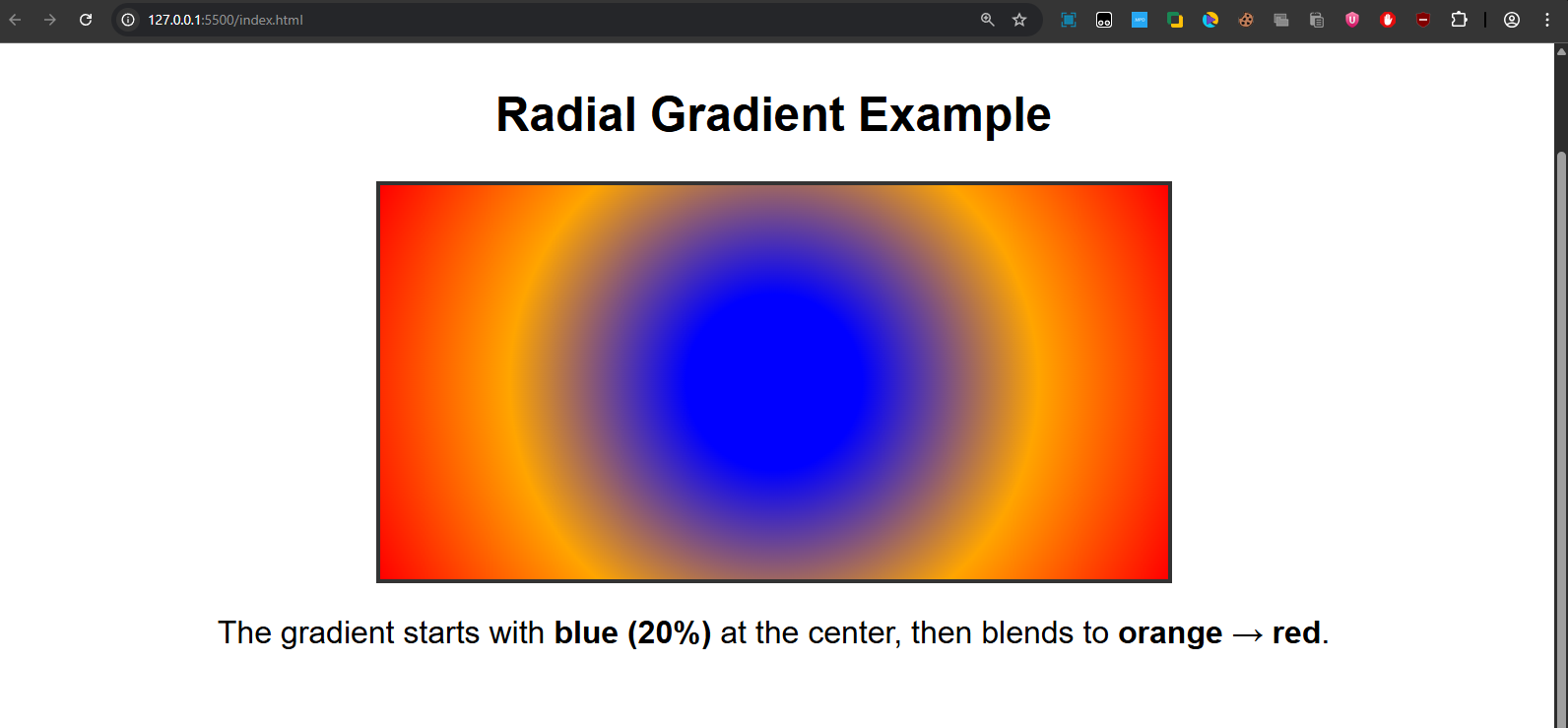
A circular gradient where the center is blue (20%), fading into orange and finally red.
3. Conic Gradient
The color gradient rotates around a specific point in the form of a cone. By default, the degree of the cone is taken as zero and starts from the center.
Syntax:
background-image: conic-gradient(from angle at position, color1, color2, ...);- from angle → starting angle (default: 0deg).
- position → where the gradient rotates around (default: center).
Example:
<!DOCTYPE html>
<html lang="en">
<head>
  <meta charset="UTF-8">
  <title>CSS Conic Gradient</title>
  <style>
    body {
      font-family: Arial, sans-serif;
      text-align: center;
      padding: 50px;
    }
    .conic-gradient-box {
      width: 400px;
      height: 200px;
      margin: auto;
      border: 2px solid #333;
      background-image: conic-gradient(blue, orange, red);
    }
  </style>
</head>
<body>
  <h2>Conic Gradient Example</h2>
  <div class="conic-gradient-box"></div>
  <p>The gradient spins around the center like a cone, blending <b>blue → orange → red</b>.</p>
</body>
</html>
Output:
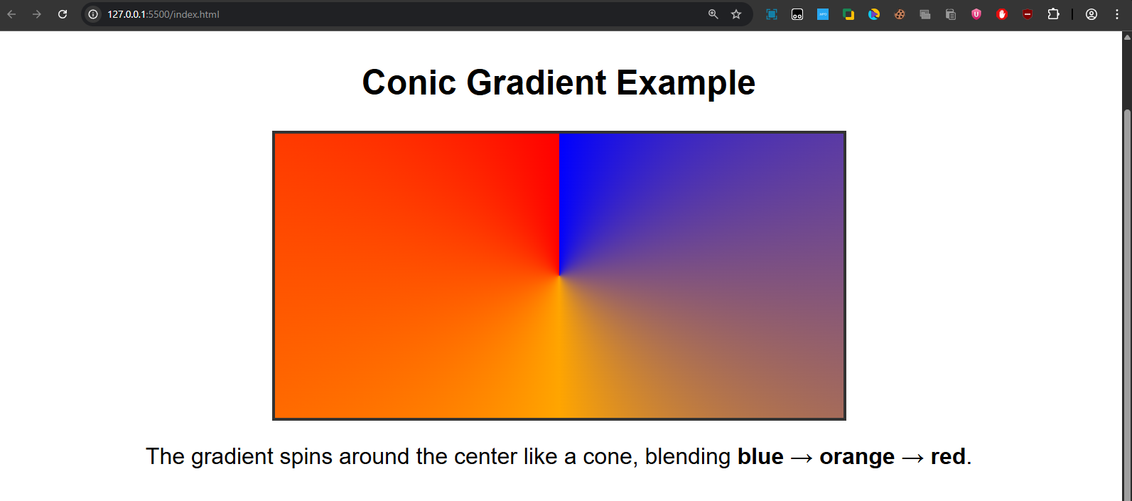
A pie-chart-like gradient rotating colors blue → orange → red around the center.
Repeating Gradients
You can also repeat gradients infinitely across the background using:
- repeating-linear-gradient()
- repeating-radial-gradient()
- repeating-conic-gradient()
Example:
<!DOCTYPE html>
<html lang="en">
<head>
  <meta charset="UTF-8">
  <title>Repeating Gradient</title>
  <style>
    body {
      font-family: Arial, sans-serif;
      text-align: center;
      padding: 50px;
    }
    .repeating-gradient-box {
      width: 400px;
      height: 200px;
      margin: auto;
      border: 2px solid #333;
      background-image: repeating-linear-gradient(45deg, blue, orange 20px, red 40px);
    }
  </style>
</head>
<body>
  <h2>Repeating Gradient Example</h2>
  <div class="repeating-gradient-box"></div>
  <p>The gradient repeats every <b>40px</b>, creating a striped pattern of blue, orange, and red.</p>
</body>
</html>
Output:
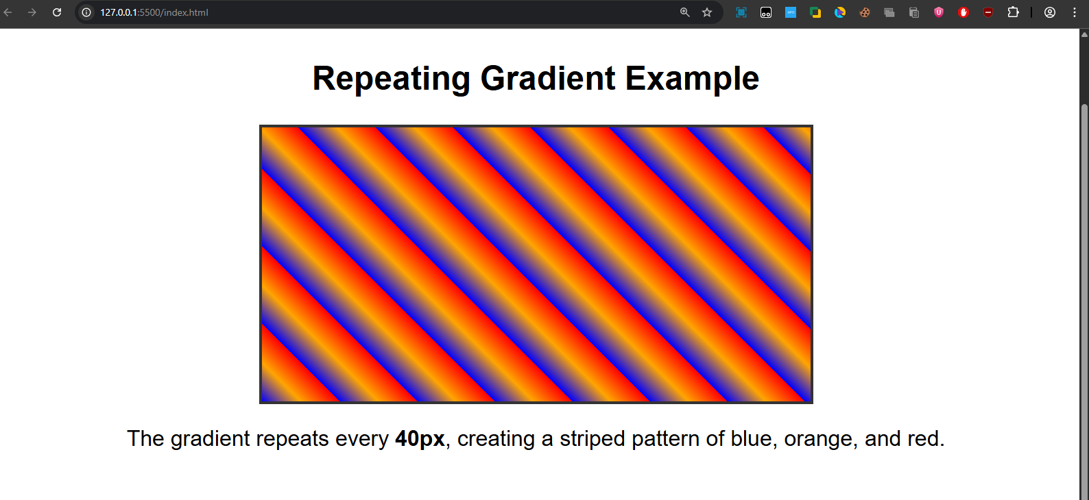
A striped diagonal pattern repeating blue → orange → red.
Quick Recap:
- Linear Gradients: Straight-line blending (vertical, horizontal, diagonal).
- Radial Gradients: Expanding circle or ellipse blending from a center point.
- Conic Gradients: Rotating color transitions like a cone or pie chart.
- Repeating Gradients: Repeated versions of any gradient pattern.