ToolTip Text
It is a special hover method to show extra text about the element when moved over it. When the mouse is hovered over that element, a tooltip dialogue box is displayed conveying the required information.
A tooltip typically consists of:
- The element (text, button, image, etc.) that the user hovers over.
- The tooltip text — a hidden element that becomes visible on hover.
The tooltip text is usually positioned above, below, or beside the hovered element.
Example:
<!DOCTYPE html>
<html>
<head>
<title>CSS Tooltip</title>
<style>
/* This is the container for the tooltip text */
.tooltip {
position: relative;
display: inline-block;
}
/* This is the actual tooltip text box */
.tooltiptext {
visibility: hidden; /* Hidden by default */
background-color: rebeccapurple;
color: wheat;
border-radius: 6px;
padding: 5px;
margin-left: 5px;
margin-top: -2px;
/* Position the tooltip text */
position: absolute;
z-index: 1; /* Ensures the tooltip appears on top of other elements */
}
/* This makes the tooltip text visible when you hover over the .tooltip container */
.tooltip:hover .tooltiptext {
visibility: visible;
}
</style>
</head>
<body style="font-family: 'Lucida Sans'">
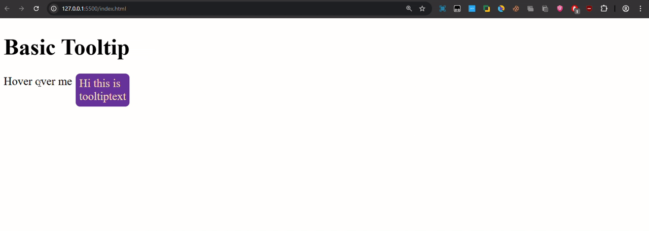
<h1>Basic Tooltip</h1>
<div class="tooltip">
Hover over me
<span class="tooltiptext">Hi this is tooltiptext</span>
</div>
</body>
</html>
Output:
This way we can add a dialogue box on the elements to add accessibility to our website.
You can also experiment with the tooltip animation by including: CSS Transitions properties here.