2D Transform
The CSS transform property allows you to visually manipulate an element in 2D space. Using transforms, you can move, rotate, resize, or skew elements without disturbing the normal document flow.
Because it’s 2D, transformations are applied only in the X (horizontal) and Y (vertical) dimensions.
Syntax:
transform: function(values);
Where function can be translate, rotate, scale, skew, etc.
1. Translate
The translate() function moves (shifts) an element along the X-axis, Y-axis, or both.
Syntax:
transform: translate(x, y);
- x → horizontal shift (positive = right, negative = left).
- y → vertical shift (positive = down, negative = up).
Example:
<!DOCTYPE html>
<html lang="en">
<head>
  <meta charset="UTF-8">
  <title>CSS Translate Example</title>
  <style>
    body { text-align: center; font-family: Arial; }
    .box {
      width: 150px; height: 150px;
      margin: 50px auto;
      background: lightblue;
      border: 2px solid navy;
      transition: transform 0.5s;
    }
    .box:hover {
      transform: translate(50px, 30px);
    }
  </style>
</head>
<body>
  <h2>Translate Example</h2>
  <div class="box"></div>
  <p>Hover the box to see it shift <b>50px right</b> and <b>30px down</b>.</p>
</body>
</html>
Output:
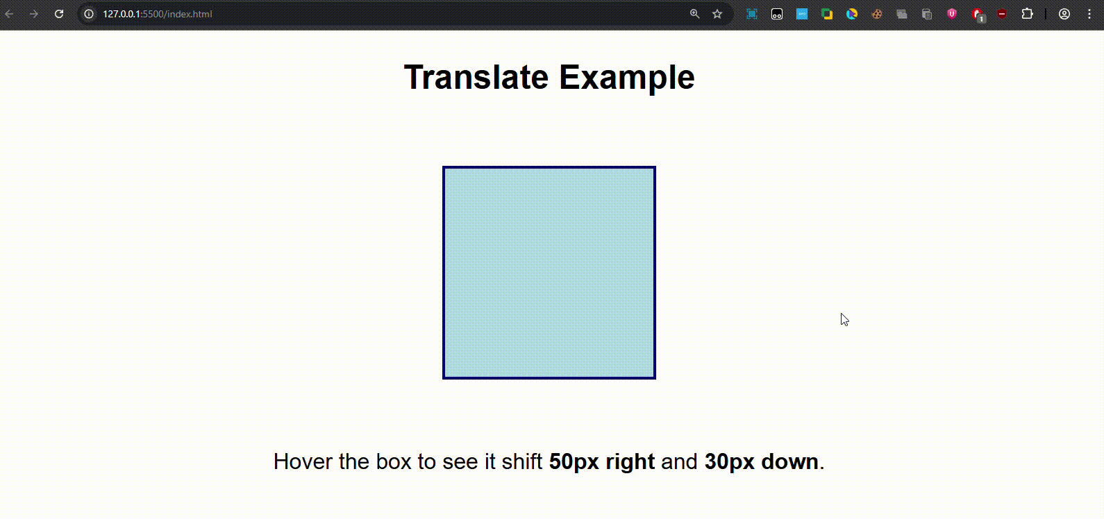
On hover, the box shifts right & down.
2. Rotate
This property rotates the content of the division either anticlockwise or clockwise according to the degree of rotation. The values are taken in degrees, and adding a negative sign makes the rotation anticlockwise.
Syntax:
transform: rotate(angle);
- Positive values → clockwise.
- Negative values → counterclockwise.
Example:
<!DOCTYPE html>
<html lang="en">
<head>
  <meta charset="UTF-8">
  <title>CSS Rotate Example</title>
  <style>
    body { text-align: center; font-family: Arial; }
    .box {
      width: 150px; height: 150px;
      margin: 50px auto;
      background: lightcoral;
      border: 2px solid maroon;
      transition: transform 0.5s;
    }
    .box:hover {
      transform: rotate(-15deg);
    }
  </style>
</head>
<body>
  <h2>Rotate Example</h2>
  <div class="box"></div>
  <p>Hover the box to rotate it <b>15 degrees counterclockwise</b>.</p>
</body>
</html>
Output:
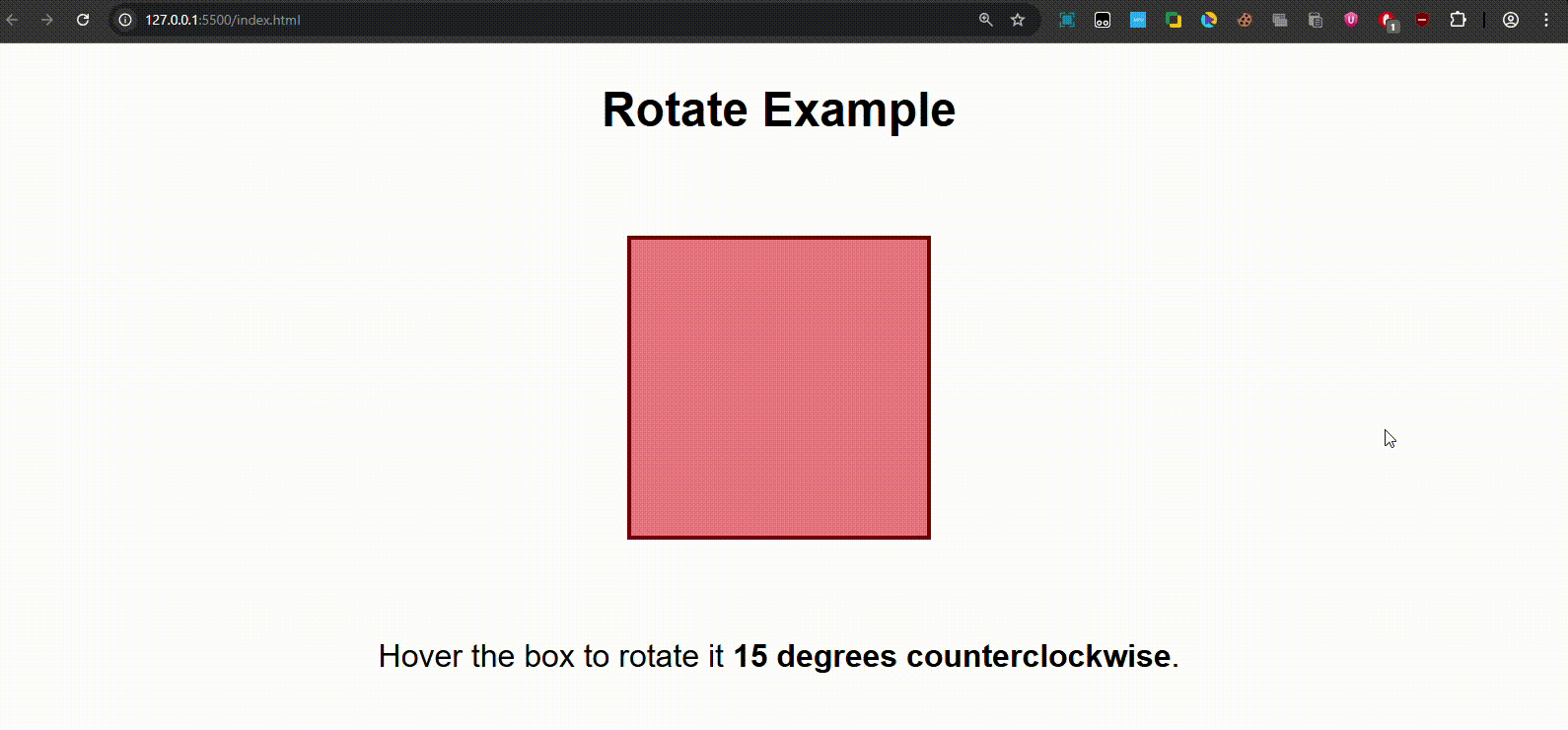
On hover, the box tilts slightly counterclockwise.
3. Scale
The scale() function resizes the element in proportion to its original dimensions.
Syntax:
transform: scale(x, y);
- x → scaling factor for width.
- y → scaling factor for height.
Note: If only one value is given (e.g., scale(1.5)), both width & height scale equally.
Example:
<!DOCTYPE html>
<html lang="en">
<head>
  <meta charset="UTF-8">
  <title>CSS Scale Example</title>
  <style>
    body { text-align: center; font-family: Arial; }
    .box {
      width: 150px; height: 150px;
      margin: 50px auto;
      background: lightgreen;
      border: 2px solid darkgreen;
      transition: transform 0.5s;
    }
    .box:hover {
      transform: scale(1.4, 1.2);
    }
  </style>
</head>
<body>
  <h2>Scale Example</h2>
  <div class="box"></div>
  <p>Hover the box to increase its <b>width by 1.4x</b> and <b>height by 1.2x</b>.</p>
</body>
</html>
Output:
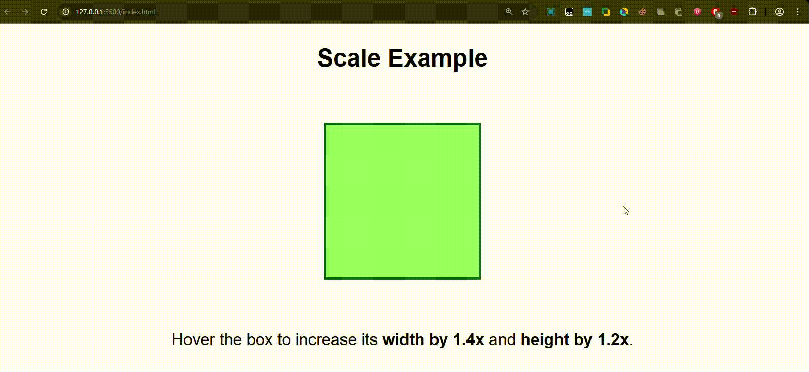
On hover, the box enlarges proportionally.
4. Skew
This property helps in adding a slant or skew to a division. (Skew: A pair of lines neither intersecting nor parallel)
Syntax:
transform: skew(x-angle, y-angle);
- skewX(angle) → skew only horizontally.
- skewY(angle) → skew only vertically.
Example:
<!DOCTYPE html>
<html lang="en">
<head>
  <meta charset="UTF-8">
  <title>CSS Skew Example</title>
  <style>
    body { text-align: center; font-family: Arial; }
    .box {
      width: 150px; height: 150px;
      margin: 50px auto;
      background: lightgoldenrodyellow;
      border: 2px solid goldenrod;
      transition: transform 0.5s;
    }
    .box:hover {
      transform: skew(15deg, 10deg);
    }
  </style>
</head>
<body>
  <h2>Skew Example</h2>
  <div class="box"></div>
  <p>Hover the box to skew it <b>15° horizontally</b> and <b>10° vertically</b>.</p>
</body>
</html>
Output:
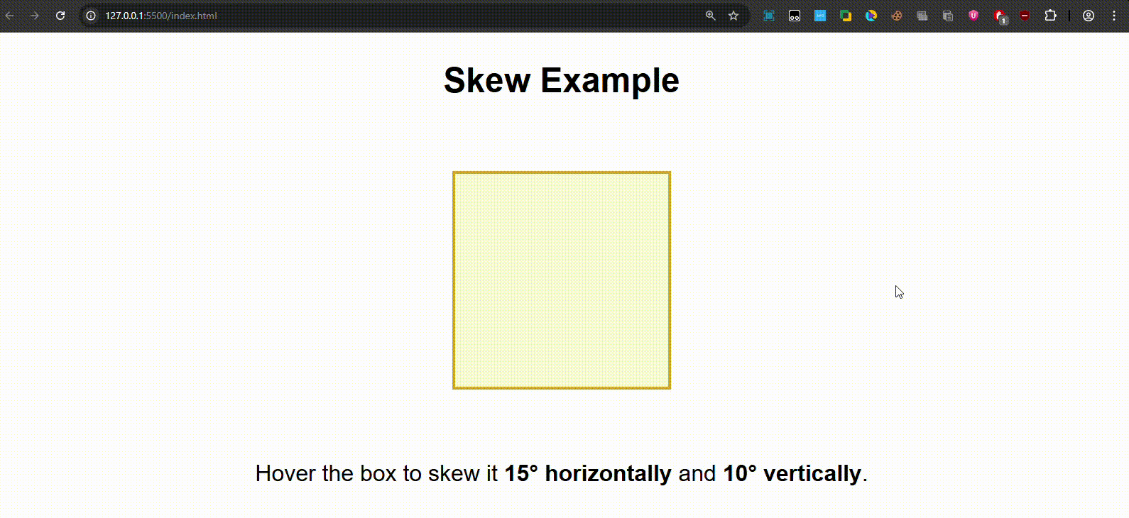
On hover, the box gets slanted diagonally.
Combining Multiple Transforms
You can chain multiple transformations together.
transform: translate(30px, 20px) rotate(20deg) scale(1.2);
This would move → rotate → scale the element in sequence.
Quick Recap -
- translate(x, y) → moves element.
- rotate(angle) → rotates element.
- scale(x, y) → resizes element.
- skew(x, y) → slants element.
- Multiple transforms can be combined.