Advanced Media Queries
We’ve discussed Media Queries briefly in this tutorial: CSS Media queries. Let’s now try to understand them in detail.
Media queries are used when we want to customize our website's presentation according to the user's screen size. With the help of media queries, users can display different markups based upon the device's general type (mobile, desktop, tablet).
It is a logical operation. Whenever a media query becomes true, then the related CSS is applied to the target element.
Instead of building different websites for desktop, tablet, and mobile, you can simply use media queries to adapt a single site for all devices.
Syntax:
@media media-type and (media-feature) {
  /* CSS rules */
}
@media signifies the start of a media query, the type property defines the display screen on which the rules are to be applied like phone, tablet, pc, etc.
Media-feature tells about the dimensions of the screen.
Example 1: Basic Media Query
<!DOCTYPE html>
<html lang="en">
<head>
  <meta charset="UTF-8">
  <meta name="viewport" content="width=device-width, initial-scale=1.0">
  <title>Basic Media Query</title>
  <style>
    body {
      background-color: lightblue;
    }

    @media screen and (max-width: 600px) {
      body {
        background-color: lightcoral;
      }
    }
  </style>
</head>
<body>
  <h1>Resize the screen to see the effect!</h1>
</body>
</html>
Output:
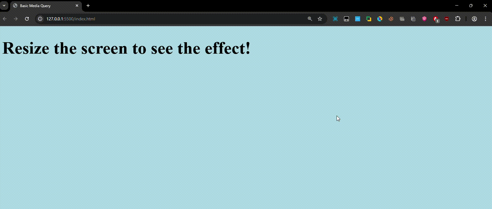
- On screens wider than 600px → Background is lightblue.
- On screens 600px or smaller → Background changes to lightcoral.
Example 2: Responsive Flexbox Layout Now let’s look at a practical example with a layout that changes based on screen size.
<!DOCTYPE html>
<html lang="en">
<head>
  <meta charset="UTF-8">
  <meta name="viewport" content="width=device-width, initial-scale=1.0">
  <title>Responsive Flexbox</title>
  <style>
    .container {
      display: flex;
      flex-direction: row;
      justify-content: space-around;
    }

    .box {
      width: 100px;
      height: 100px;
      background-color: teal;
      color: white;
      display: flex;
      justify-content: center;
      align-items: center;
      margin: 10px;
    }

    /* Media Query */
    @media screen and (max-width: 600px) {
      .container {
        flex-direction: column;
        align-items: center;
      }

      .box {
        width: 80%;
      }
    }
  </style>
</head>
<body>
  <div class="container">
    <div class="box">Box 1</div>
    <div class="box">Box 2</div>
    <div class="box">Box 3</div>
    <div class="box">Box 4</div>
  </div>
</body>
</html>
Output:
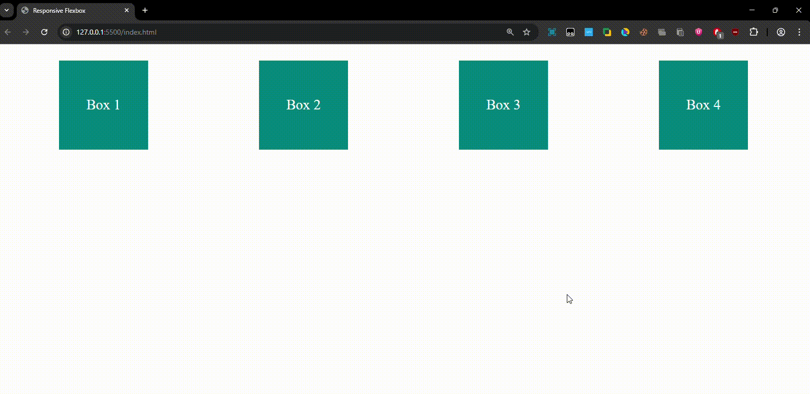
- On large screens (>600px): Boxes appear side by side in a row.
- On small screens (≤600px): Boxes stack vertically and center-align.
Commonly Used Media Features
-
Width & Height
@media (max-width: 768px) { ... } /* Tablets and below */ @media (max-width: 480px) { ... } /* Mobile devices */ -
Orientation
@media (orientation: portrait) { ... } @media (orientation: landscape) { ... } -
Device Type
@media screen { ... } /* Default for screens */ @media print { ... } /* Printer-friendly styling */ -
Aspect Ratio
@media (min-aspect-ratio: 16/9) { ... } -
Combining Conditions
@media screen and (min-width: 600px) and (orientation: landscape) { ... }
Example 3: Multi-Breakpoint Responsive Design
<!DOCTYPE html>
<html lang="en">
<head>
  <meta charset="UTF-8">
  <meta name="viewport" content="width=device-width, initial-scale=1.0">
  <title>Multi Breakpoint</title>
  <style>
    body {
      background-color: white;
      font-family: Arial, sans-serif;
    }

    h1 {
      text-align: center;
    }

    /* Mobile */
    @media (max-width: 480px) {
      body {
        background-color: lightgreen;
      }
    }

    /* Tablet */
    @media (min-width: 481px) and (max-width: 768px) {
      body {
        background-color: lightgoldenrodyellow;
      }
    }

    /* Desktop */
    @media (min-width: 769px) {
      body {
        background-color: lightblue;
      }
    }
  </style>
</head>
<body>
  <h1>Resize the window to see color changes!</h1>
</body>
</html>
Output:
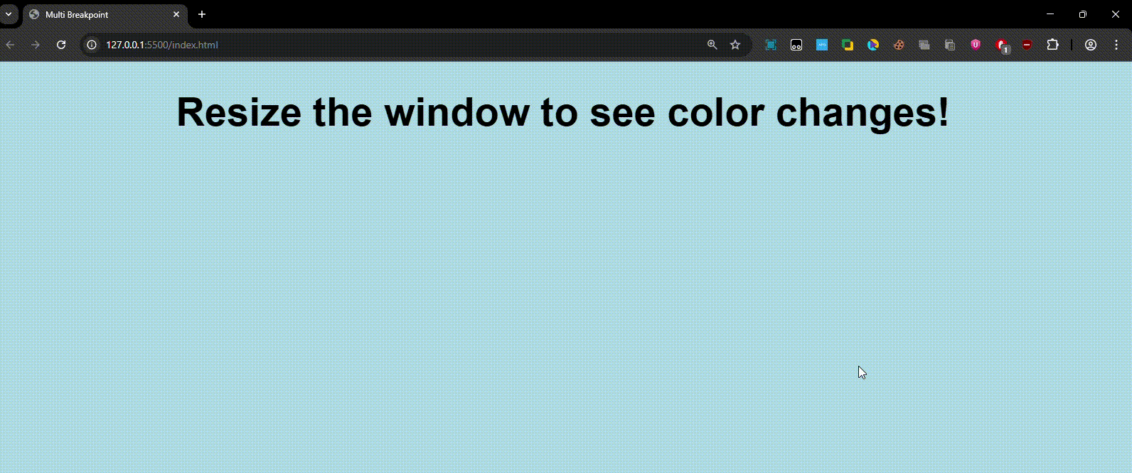
- Mobile (<480px): Green background.
- Tablet (481px–768px): Yellow background.
- Desktop (>769px): Blue background.
Quick Recap -
- Media queries make your website responsive.
- Use breakpoints to target devices (mobile, tablet, desktop).
- Common features: width, height, orientation, aspect-ratio.
- Best practice: Start with mobile-first design (min-width) and build upwards.