Animations
CSS Animations help to animate elements from one frame to another. Controlling various CSS properties helps in changing the animation style and time without having the need to use JavaScript for the same.
1. Introduction to CSS Animations
Animations in CSS are built around two main components:
- @keyframes → Defines what changes happen during the animation.
- animation properties → Define how the animation runs (duration, timing, loop, etc.).
For example:
@keyframes demo {
    from { background-color: red; }
    to { background-color: blue; }
}
This animation changes a div’s background color from red to blue.
To use it, we assign the animation name and duration:
div {
    animation-name: demo;
    animation-duration: 3s;
}
2. Keyframes in Detail
Keyframes allow you to define styles at specific points in time using percentages (0% → start, 100% → end).
@keyframes moveBox {
    0% { transform: translateX(0px); background: red; }
    50% { transform: translateX(150px); background: yellow; }
    100% { transform: translateX(0px); background: green; }
}
This creates a smooth animation: red box → yellow box → green box.
3. Animation Properties
Here are the important properties you can use:
| Property | Description |
|---|---|
| animation-name | Assigns the keyframe animation. |
| animation-duration | Time taken for one cycle (e.g., 2s, 500ms). |
| animation-iteration-count | Number of loops (1, 3, infinite). |
| animation-delay | Time before animation starts (can be negative). |
| animation-direction | Direction (normal, reverse, alternate, alternate-reverse). |
| animation-timing-function | Speed curve (ease, linear, ease-in, ease-out, ease-in-out). |
| animation-fill-mode | How element looks before/after animation (none, forwards, backwards, both). |
| animation | Shorthand property to combine all of the above. |
Now, we will see some examples and will learn about the animations properly -
Example 1: Basic Animation (Color Change)
<!DOCTYPE html>
<html>
<head>
  <style>
    div {
      width: 150px;
      height: 150px;
      background: red;
      animation-name: colorChange;
      animation-duration: 3s;
    }
    @keyframes colorChange {
      from { background: red; }
      to { background: blue; }
    }
  </style>
</head>
<body>
  <h2>Basic Animation</h2>
  <div></div>
</body>
</html>
Output:
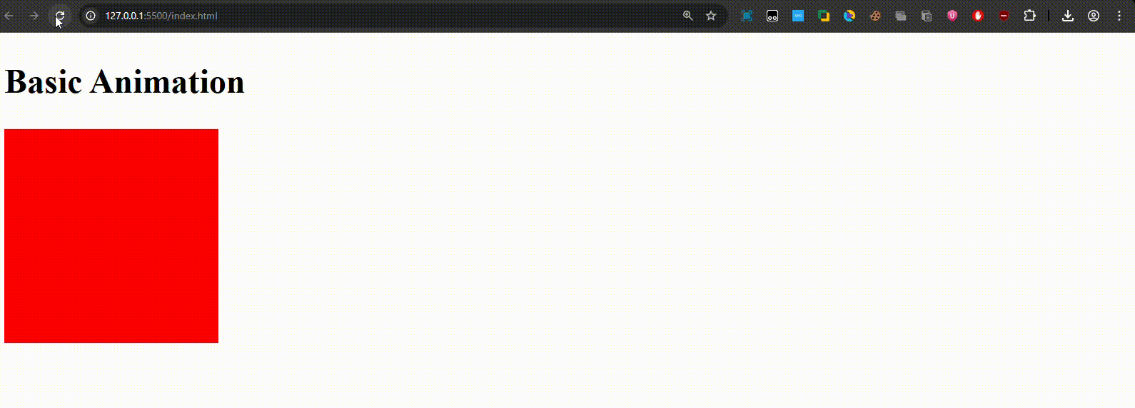
The red box smoothly changes its color to blue in 3 seconds.
Example 2: Keyframes + Looping
<!DOCTYPE html>
<html>
<head>
  <style>
    div {
      width: 100px;
      height: 100px;
      background: red;
      animation-name: moveBox;
      animation-duration: 4s;
      animation-iteration-count: infinite;
    }
    @keyframes moveBox {
      0%   { transform: translateX(0px); background: red; }
      50%  { transform: translateX(200px); background: yellow; }
      100% { transform: translateX(0px); background: green; }
    }
  </style>
</head>
<body>
  <h2>Looping Animation</h2>
  <div></div>
</body>
</html>
Output:
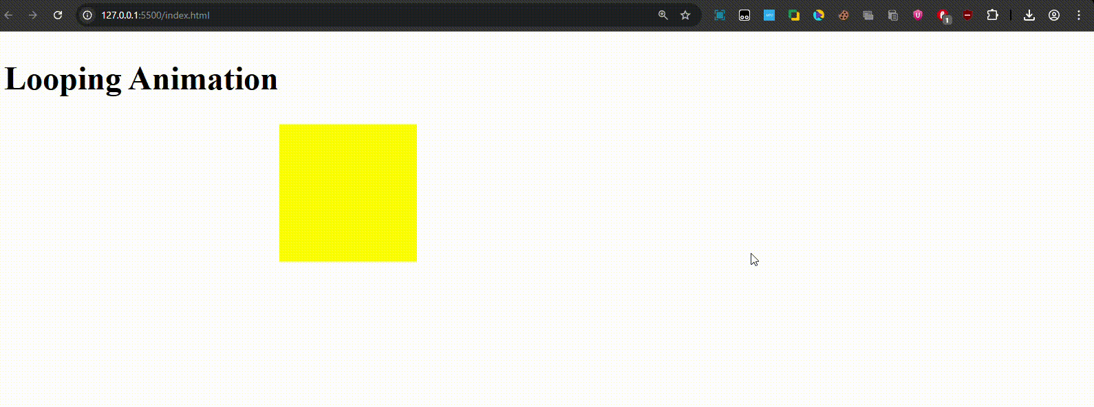
A red box moves to the right, turns yellow, then returns to the left as green — repeating forever.
Example 3: Advanced Animation (Shorthand)
<!DOCTYPE html>
<html>
<head>
  <style>
    div {
      width: 120px;
      height: 120px;
      background: orange;
      animation: spinScale 5s ease-in-out 1s infinite alternate both;
    }
    @keyframes spinScale {
      0%   { transform: rotate(0deg) scale(1); background: orange; }
      50%  { transform: rotate(180deg) scale(1.3); background: purple; }
      100% { transform: rotate(360deg) scale(1); background: teal; }
    }
  </style>
</head>
<body>
  <h2>Advanced Animation (Shorthand)</h2>
  <div></div>
</body>
</html>
Output:
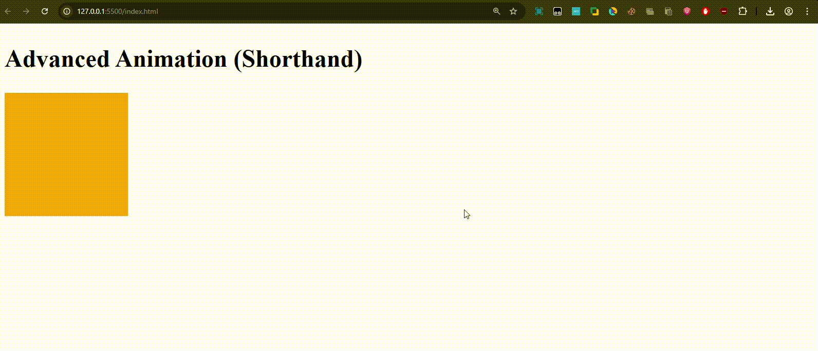
A box spins 360°, scales up at mid-point, and changes colors, repeating infinitely with smooth alternate motion.
CSS Animations let you create everything from simple fades to complex interactive effects — without writing a single line of JavaScript.