Shadows
When styling websites, adding depth and focus to elements helps improve the design and user experience. CSS provides two powerful tools for this: shadows (box-shadow, text-shadow) and outlines.
Let’s explore them one by one.
1. Box Shadows
box-shadow is a popular CSS property that enables designers to add shadow effects around an element's frame. It can be used to give any element, be it a div, image, or button, a 3D feel or to emphasize on hover.
Syntax:
box-shadow: h-offset v-offset blur spread color inset;
h-offsetandv-offset: Determines the shadow's horizontal and vertical position.blur: The larger the value, the blurrier the shadow.spread: Expands or shrinks the shadow size.color: Defines the shadow color.inset: Makes the shadow inner.
Example: Basic Shadow
.card {
  width: 200px;
  height: 100px;
  background: white;
  box-shadow: 5px 5px 15px 5px #888888;
}
This adds a soft grey shadow to the element, giving it a floating effect.
Example: Inset Shadow
.input-box {
  width: 250px;
  padding: 10px;
  border: 1px solid #ccc;
  box-shadow: inset 2px 2px 5px rgba(0, 0, 0, 0.3);
}
The shadow is inside the input field, giving a pressed look.
Complete Code-
<!DOCTYPE html>
<html lang="en">
<head>
  <meta charset="UTF-8">
  <meta name="viewport" content="width=device-width, initial-scale=1.0">
  <title>Box Shadow Example</title>
  <style>
    body {
      font-family: Arial, sans-serif;
      padding: 20px;
      background: #f9f9f9;
    }

    .card {
      width: 220px;
      height: 120px;
      background: white;
      box-shadow: 5px 5px 15px 5px #888888;
      padding: 20px;
      margin-bottom: 20px;
    }

    .input-box {
      width: 250px;
      padding: 10px;
      border: 1px solid #ccc;
      box-shadow: inset 2px 2px 6px rgba(0,0,0,0.3);
    }
  </style>
</head>
<body>

  <h2>Box Shadow Example</h2>

  <div class="card">This is a box with outer shadow.</div>

  <input type="text" class="input-box" placeholder="Inset shadow input">

</body>
</html>
Output:
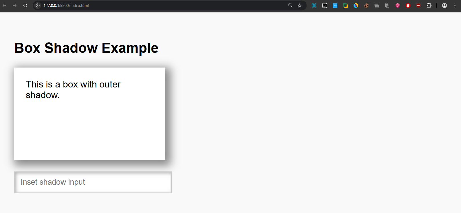
- The white box (.card) looks elevated from the page because of the outer shadow applied using box-shadow.
- The input field has an inset shadow, making it look like the text area is “pushed inside” the box.
2. Text Shadows
text-shadow is utilized to give shadows specifically to the text. It can elevate the readability of the text or give it an elegant appearance.
Syntax:
text-shadow: h-offset v-offset blur color;
Example: Elegant Text Shadow
.heading {
  font-size: 40px;
  color: #333;
  text-shadow: 2px 2px 4px #888888;
}
Adds a soft grey shadow under the text.
Example: Glow Effect
.glow {
  font-size: 40px;
  color: white;
  text-shadow: 0 0 10px #00f, 0 0 20px #00f, 0 0 30px #00f;
}
Multiple shadows can create a neon glow effect.
Complete Code-
<!DOCTYPE html>
<html lang="en">
<head>
  <meta charset="UTF-8">
  <meta name="viewport" content="width=device-width, initial-scale=1.0">
  <title>Text Shadow Example</title>
  <style>
    body {
      font-family: Arial, sans-serif;
      padding: 20px;
      background: #f9f9f9;
    }

    .heading {
      font-size: 40px;
      color: #333;
      text-shadow: 2px 2px 4px #888888;
      margin-bottom: 20px;
    }

    .glow {
      font-size: 40px;
      color: white;
      background: black;
      display: inline-block;
      padding: 10px;
      text-shadow: 0 0 10px #00f, 0 0 20px #00f, 0 0 30px #00f;
    }
  </style>
</head>
<body>

  <h2>Text Shadow Example</h2>

  <div class="heading">Elegant Text Shadow</div><br>
  <div class="glow">Glowing Text Effect</div>

</body>
</html>
Output:
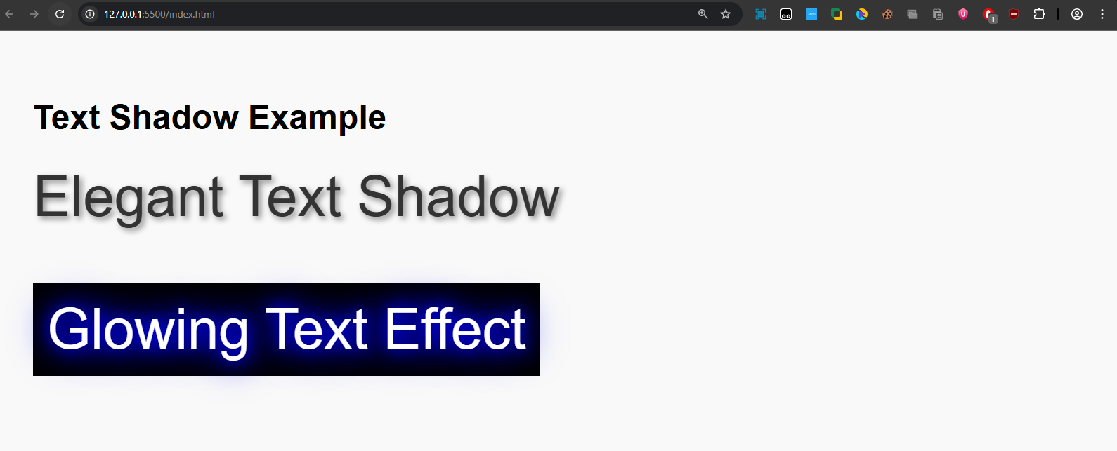
- The first text (Elegant Text Shadow) has a soft gray shadow, giving it a subtle depth effect.
- The second text (Glowing Text Effect) has multiple blue shadows, making the text appear as if it is glowing in the dark.
3. Outlines
An outline is a line that is drawn around elements, outside the borders, to make the element "stand out". It's commonly used for accessibility purposes, like highlighting focused elements.
Syntax:
outline: width style color;
width: Sets the outline width.style: Determines the style of the outline such as solid, dotted, or dashed.color: Sets the outline color.
Example: Focused Button
.button:focus {
  outline: 2px solid blue;
}
When the button is focused, it gets a blue outline.
Example: Outline with Offset
.box {
  width: 150px;
  height: 80px;
  background: lightcoral;
  outline: 3px dashed black;
  outline-offset: 5px;
}
The outline is placed 5px away from the element’s border.
Complete Code-
<!DOCTYPE html>
<html lang="en">
<head>
  <meta charset="UTF-8">
  <meta name="viewport" content="width=device-width, initial-scale=1.0">
  <title>Outline Example</title>
  <style>
    body {
      font-family: Arial, sans-serif;
      padding: 20px;
      background: #f9f9f9;
    }

    .button:focus {
      outline: 2px solid blue;
    }

    .box {
      width: 160px;
      height: 80px;
      background: lightcoral;
      outline: 3px dashed black;
      outline-offset: 5px;
      margin-top: 20px;
    }
  </style>
</head>
<body>

  <h2>Outline Example</h2>

  <button class="button">Click or Tab Me</button>
  <div class="box">Box with Outline</div>

</body>
</html>
Output:
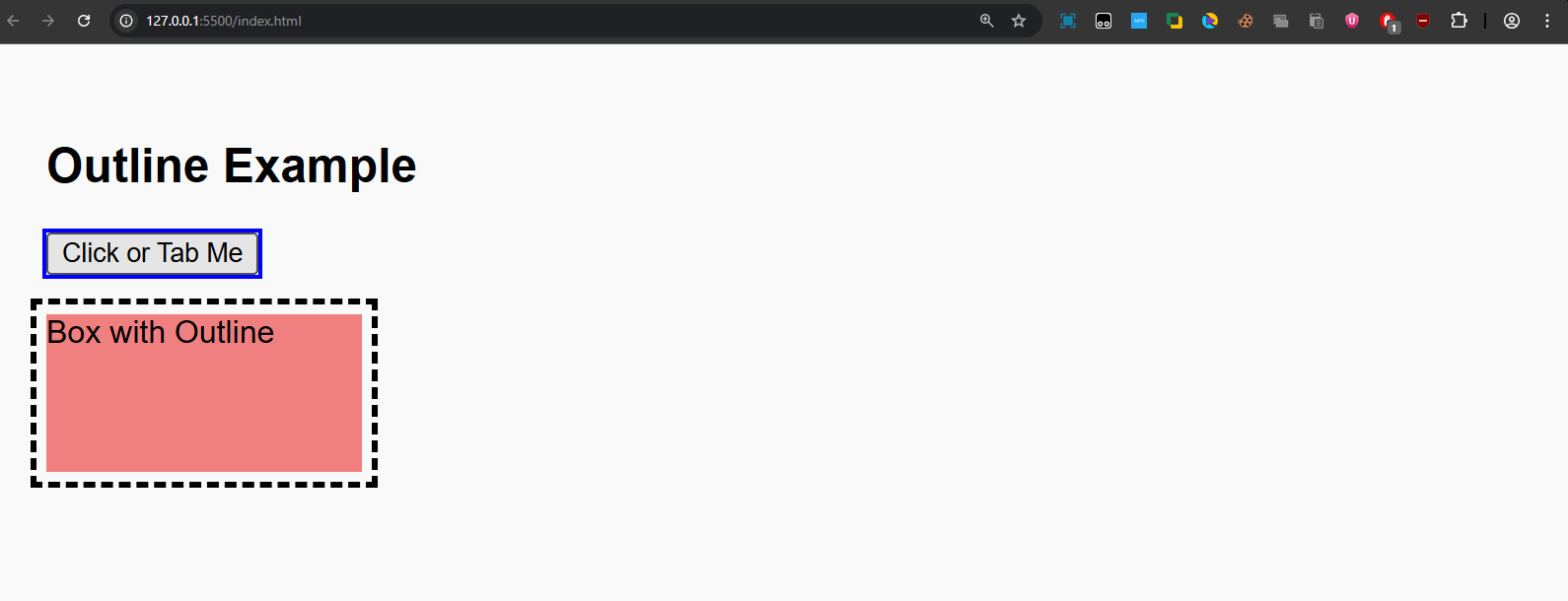
- When you click or press tab on the button, a blue outline appears, showing that the button is in focus.
- The second box has a dashed black outline with a gap (offset) between the box edge and the outline, making it stand out clearly.
4. Key Differences: Outline vs Border
While both can visually appear similar, outlines differ from borders in a few ways:
| Feature | Border | Outline |
|---|---|---|
| Position | Takes up space inside layout | Drawn outside, doesn’t affect layout |
| Offset | No offset property | outline-offset can push it outward |
| Width control | Can vary on each side | Always uniform on all sides |
| Rounded corners | Works with border-radius |
No rounded corners (usually) |