Border Images
Borders in CSS aren’t limited to just solid, dashed, or dotted lines. With the border-image property, you can use custom images as borders around elements. This allows you to create creative, decorative frames and unique styling for text, divs, or boxes.
For example: Let’s try adding this image as a background around the text.

Syntax of border-image:
selector {
  border: width style color;     /* Must declare a border */
  border-image-source: url(image.png);  /* The image to use */
  border-image-slice: value;     /* How the image is divided */
  border-image-repeat: stretch | repeat | round;  /* How it’s repeated */
}
The border property (width + style) is mandatory because border-image replaces the border style.
Example 1: Basic Border Image
<!DOCTYPE html>
<html lang="en">
<head>
  <meta charset="UTF-8">
  <meta name="viewport" content="width=device-width, initial-scale=1.0">
  <title>CSS Border Image - Basic Example</title>
  <style>
    body {
      font-family: Arial, sans-serif;
      background: #f7f7f7;
      padding: 30px;
      text-align: center;
    }

    .box {
      width: 300px;
      margin: auto;
      padding: 20px;
      font-size: 18px;
      border: 20px solid transparent;  /* border width is required */
      border-image: url('https://cwh-full-next-space.fra1.digitaloceanspaces.com/tutorial/css-border-images/border.webp') 30 round;
    }
  </style>
</head>
<body>
  <h2>Basic Border Image</h2>
  <div class="box">This box uses an image as its border.</div>
</body>
</html>
Output:
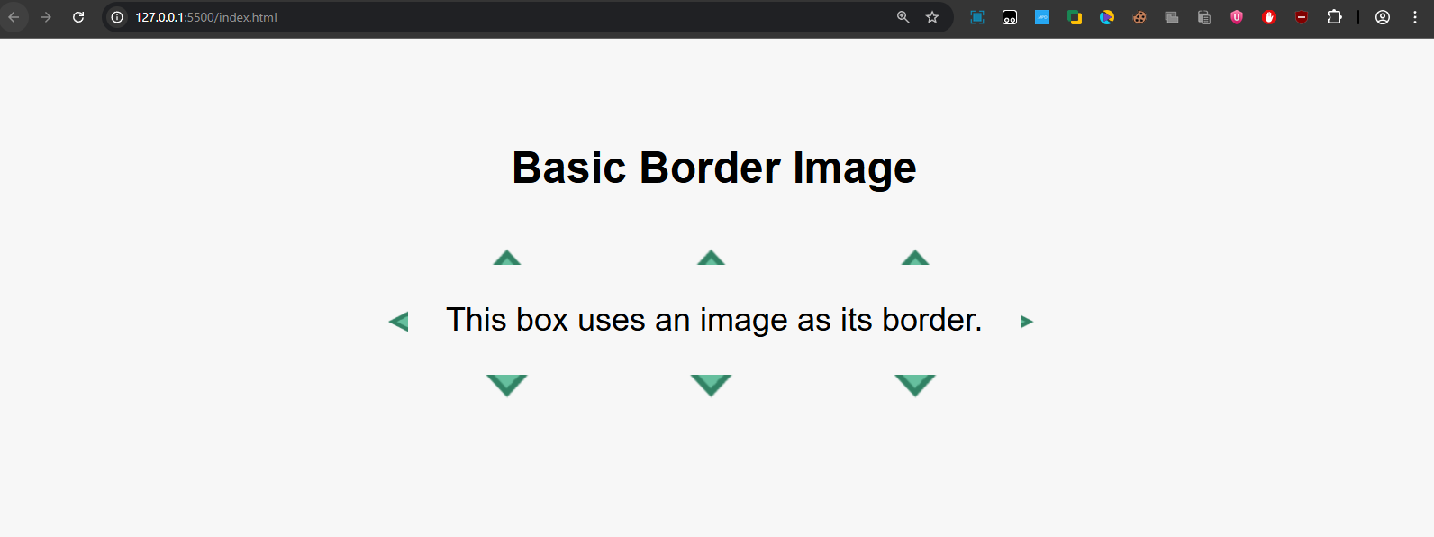
- The border-image property replaces the normal border with the image.
- The 30 is the slice value (cutting parts of the image).
- The round keyword ensures the border image tiles evenly around all sides.
Example 2: Changing Border Slice Values
The border-image-slice defines how much of the image is used for the border.
- Smaller values = thinner border pieces.
- Larger values = thicker border pieces.
<!DOCTYPE html>
<html lang="en">
<head>
  <meta charset="UTF-8">
  <meta name="viewport" content="width=device-width, initial-scale=1.0">
  <title>CSS Border Image - Slice Example</title>
  <style>
    body {
      font-family: Arial, sans-serif;
      background: #f7f7f7;
      padding: 30px;
      text-align: center;
    }

    .box {
      width: 280px;
      margin: 20px auto;
      padding: 20px;
      border: 20px solid transparent;
      border-image-source: url('https://cwh-full-next-space.fra1.digitaloceanspaces.com/tutorial/css-border-images/border.webp');
      border-image-repeat: round;
    }

    .slice30 {
      border-image-slice: 30;
    }

    .slice50 {
      border-image-slice: 50;
    }
  </style>
</head>
<body>
  <h2>Border Slice Values</h2>
  <div class="box slice30">This uses <b>30%</b> slice</div>
  <div class="box slice50">This uses <b>50%</b> slice</div>
</body>
</html>
Output:
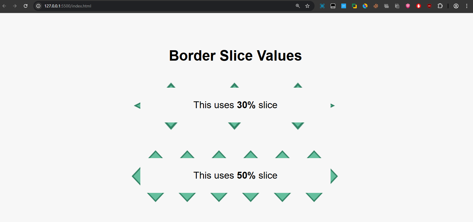
- The first box (30%) shows a tighter, smaller border image.
- The second box (50%) makes the border image appear thicker and bolder.
Key Points to Remember
- Always declare border: X solid transparent; before using border-image.
- Use border-image-slice to control how much of the image is used.
- border-image-repeat helps decide whether the image should stretch, repeat, or round.
- This property works best with symmetric decorative images like frames or patterns.