Masking
Masking is used to blend one layer over another either partially or fully. There can be various methods of doing so like using an image as a layer, using a linear gradient, radial gradient, conic gradient, etc.
Syntax:
mask-image: url(image.png);   /* or linear-gradient(), radial-gradient(), etc. */
mask-repeat: no-repeat;
mask-position: center;
mask-size: cover;
Example:
<!DOCTYPE html>
<html>
  <head>
    <title>CSS Masking</title>
    <style>
      span {
        display: flex;
        flex-direction: row;
        padding: 10px;
      }

      .mask1 {
        mask-image: linear-gradient(white, transparent);
      }
    </style>
  </head>
  <body>
    <h1>The mask-image Property</h1>

    <span>
      <h3>Masked image:</h3>
      <div class="mask1">
        <img src="logo.jpg" width="300" height="300" />
      </div>

      <h3>Original image:</h3>
      <img src="logo.jpg" width="300" height="300" />
    </span>
  </body>
</html>
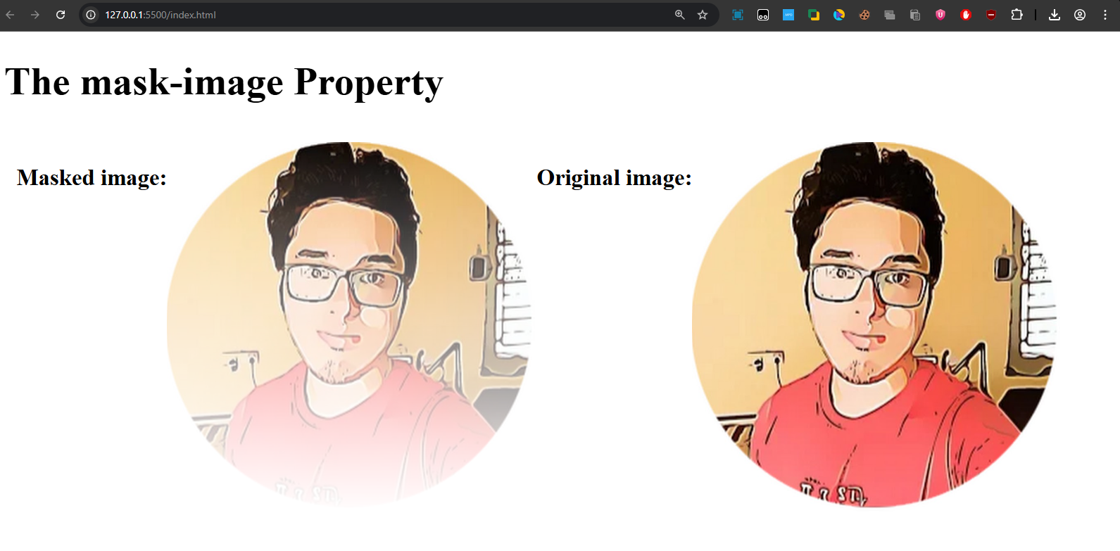
Output:
Real-World Uses of Masking
- Text Masking – Apply an image inside text.
- Creative Hover Effects – Reveal hidden parts of an image.
- Shape Cropping – Display images in custom shapes without editing.
- Fading Effects – Smoothly hide/reveal content with gradients.