Images
Images are an essential part of a website. They help enhance the look and feel of your web pages and make content more engaging.
Basic Image Syntax
<img src="img_location" alt="alt_text">- src: The path of the image.
- alt: Alternate text for the image, if the image is not displayed due to any issue.
Example:
<html lang="en">
<head>
<title>CWH</title>
</head>
<body>
<img src="./cwh.png" alt="cwh">
</body>
</html>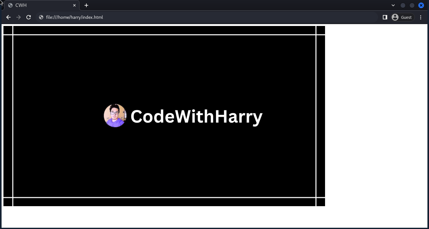
There are various properties of a CSS image, which are as follows:
Image Width and Height
There are two ways to specify the width and height of the image.
Using Inline CSS -
Example:
<html lang="en">
<head>
<title>CWH</title>
</head>
<body>
<img src="./cwh.png" height="300" width="400" alt="cwh">
</body>
</html>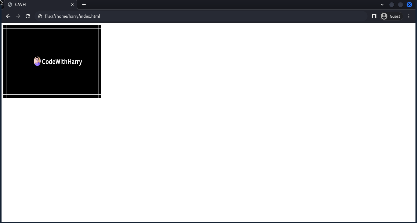
Here, the width and height are in pixels (px).
Internal/External CSS
Example:
<html lang="en">
<head>
<title>CWH</title>
<style>
img {
width: 600px;
height: 400px;
}
</style>
</head>
<body>
<img src="./cwh.png" alt="cwh">
</body>
</html>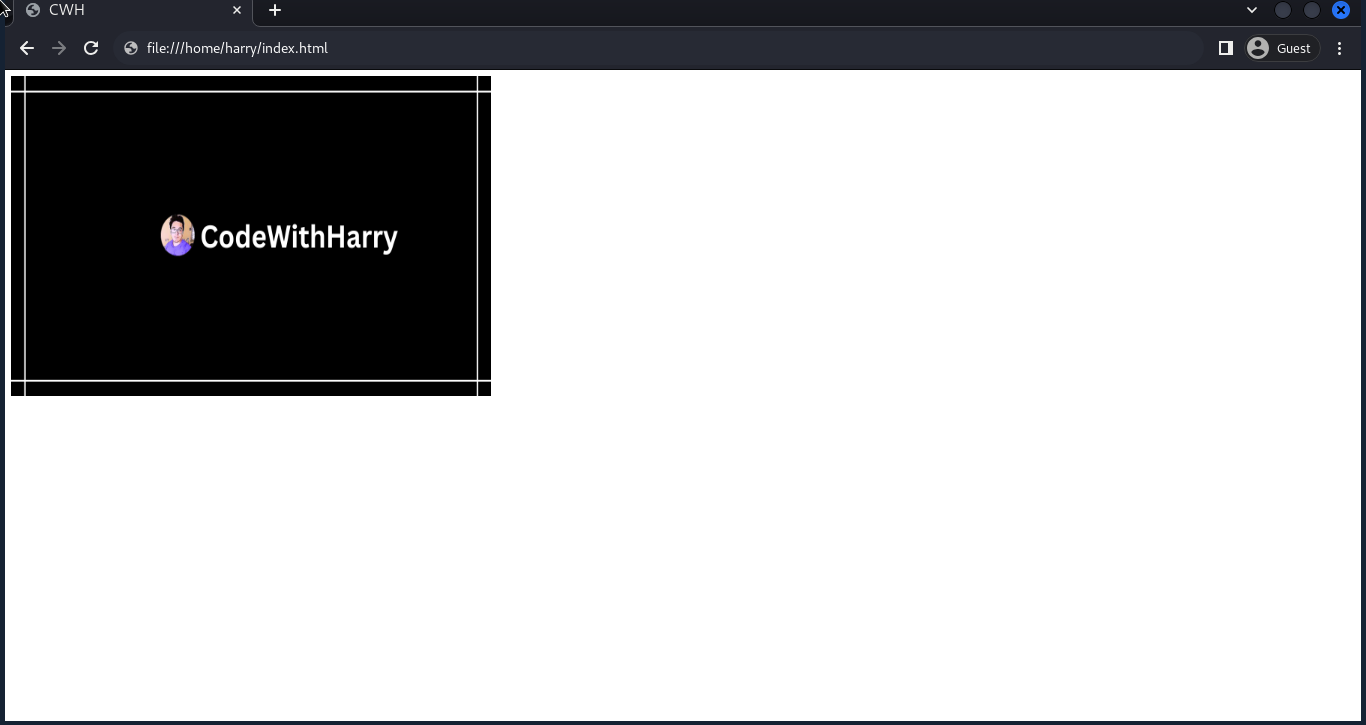
Note: We can use pixels (px), percentages (%), or any other unit to specify the width and height of the image.
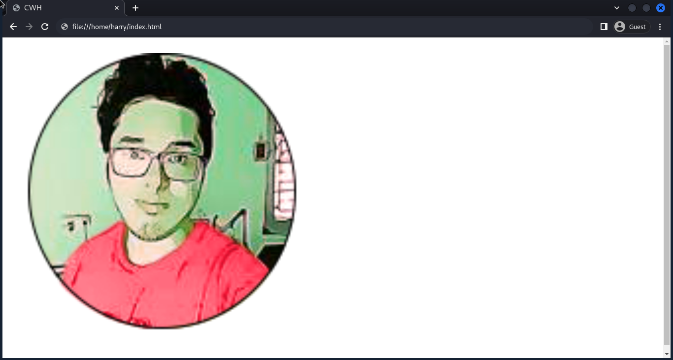
Image Border Radius
Image border-radius helps create rounded corners for the image.
Syntax:
selector {
border-radius: units;
}Example:
<html lang="en">
<head>
<title>CWH</title>
<style>
img {
border-radius: 25px;
}
</style>
</head>
<body>
<img src="./cwh.png" alt="cwh">
</body>
</html>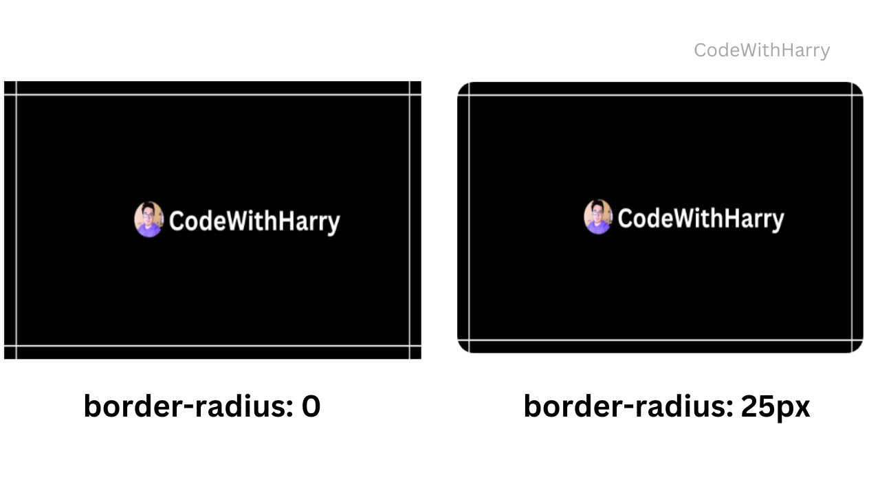
Responsive Images
Responsive images help to give a clear view of the image at different sizes of the screen.
Syntax:
selector {
max-width: units;
height: auto;
}height: auto helps to achieve the responsive layout of the image.
To play around with a responsive layout, follow the steps:
- Right-click and click on inspect.
- Click on the toggle device toolbar (laptop mobile icon) or (Ctrl + Shift + M).
- Change the dimensions and play around.
There are other ways to make the image responsive, such as:
fit-content
The fit content specifies the size of that element, which should be determined by its content.
Syntax:
selector {
width: fit-content;
}We can also set the maximum width of the element.
selector {
width: fit-content(200px);
}Here, the element's width will be as wide as its content, up to a maximum of 200 pixels.
max-content
The max-content property makes the element as wide as its content but not wider than the screen.
selector {
width: max-content;
}min-content
The min-content property makes the element's width shrink to the minimum required to display its content.
selector {
width: min-content;
}Image Opacity
Image opacity controls the transparency of the image. The property value ranges from 0 to 1.
Syntax:
img {
opacity: unit;
}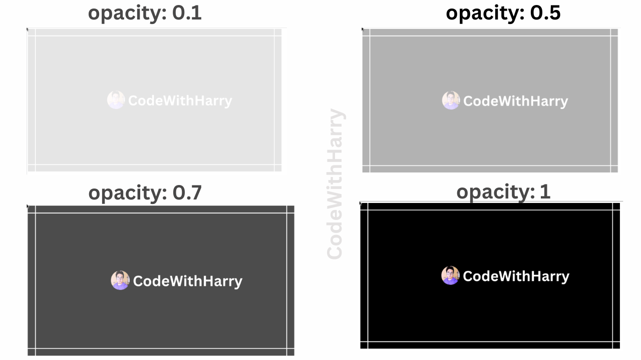
Image Filter
The CSS image filter allows you to apply various visual effects to the image.
Syntax:
img {
filter: property-value;
}Here, property value can be any of the following:
Grayscale
Grayscale converts an image to grayscale, i.e., black and white. It sort of adds an overlay of grey color to the image.
Example:
img {
filter: grayscale(100%);
}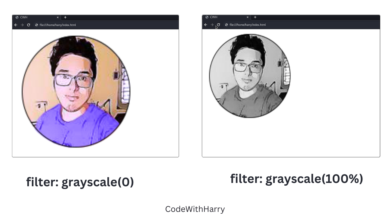
Note: The grayscale value ranges between 0 and 100 percent. 0 is the default image, and 100% is fully black and white.
Blur
Blur applies a blur effect to the image.
Example:
img {
filter: blur(5px);
}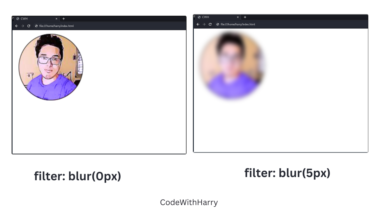
Note: The blur value is specified in pixels (px).
Brightness
The brightness property value helps in adjusting the brightness of the image.
img {
filter: brightness(180%);
}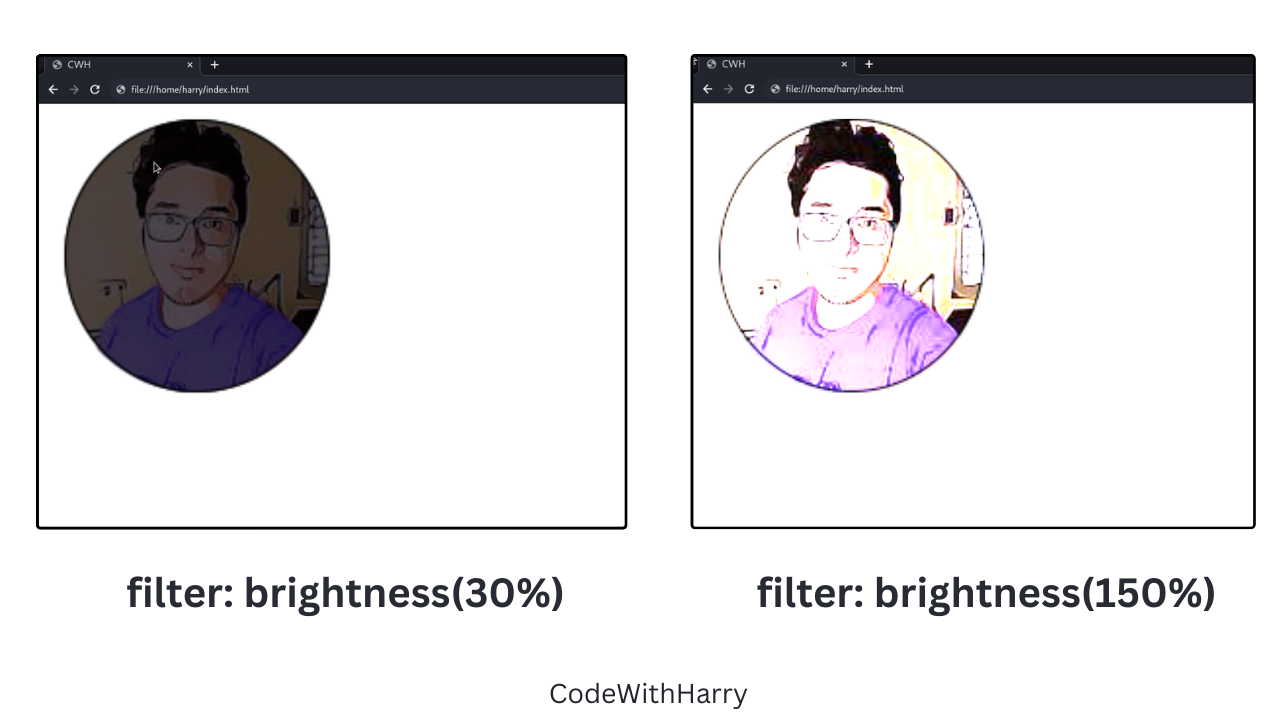
Note: The brightness level is specified in percentage. 0 being the black image, as brightness will be 0%, and as the value increases, brightness content increases.
Contrast
The contrast helps in adjusting the contrast of the image.
img {
filter: contrast(10%);
}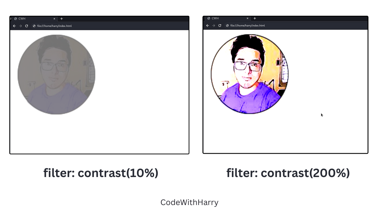
Note: The contrast level is specified in percentage.
Invert
Invert is used to invert the colours of the image.
img {
filter: invert(10%);
}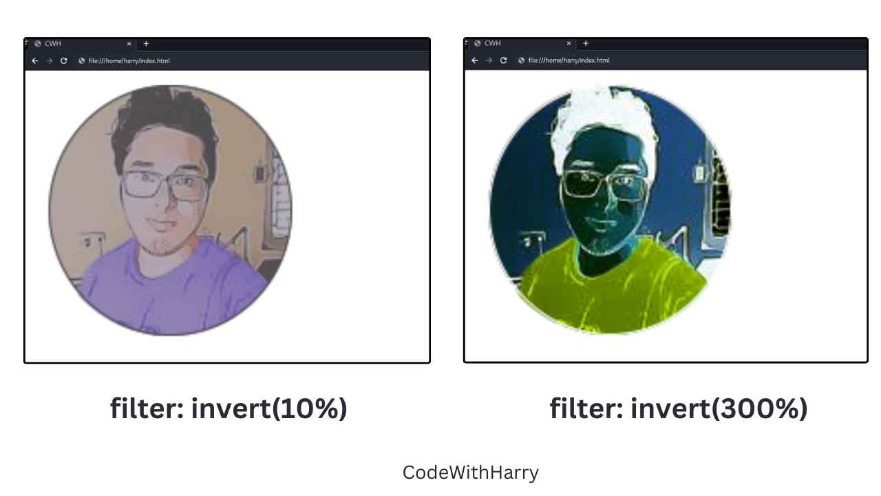
Note: The invert value is specified in percentage.
Saturate
Saturate helps to adjust the saturation level of colours.
img {
filter: saturate(100%);
}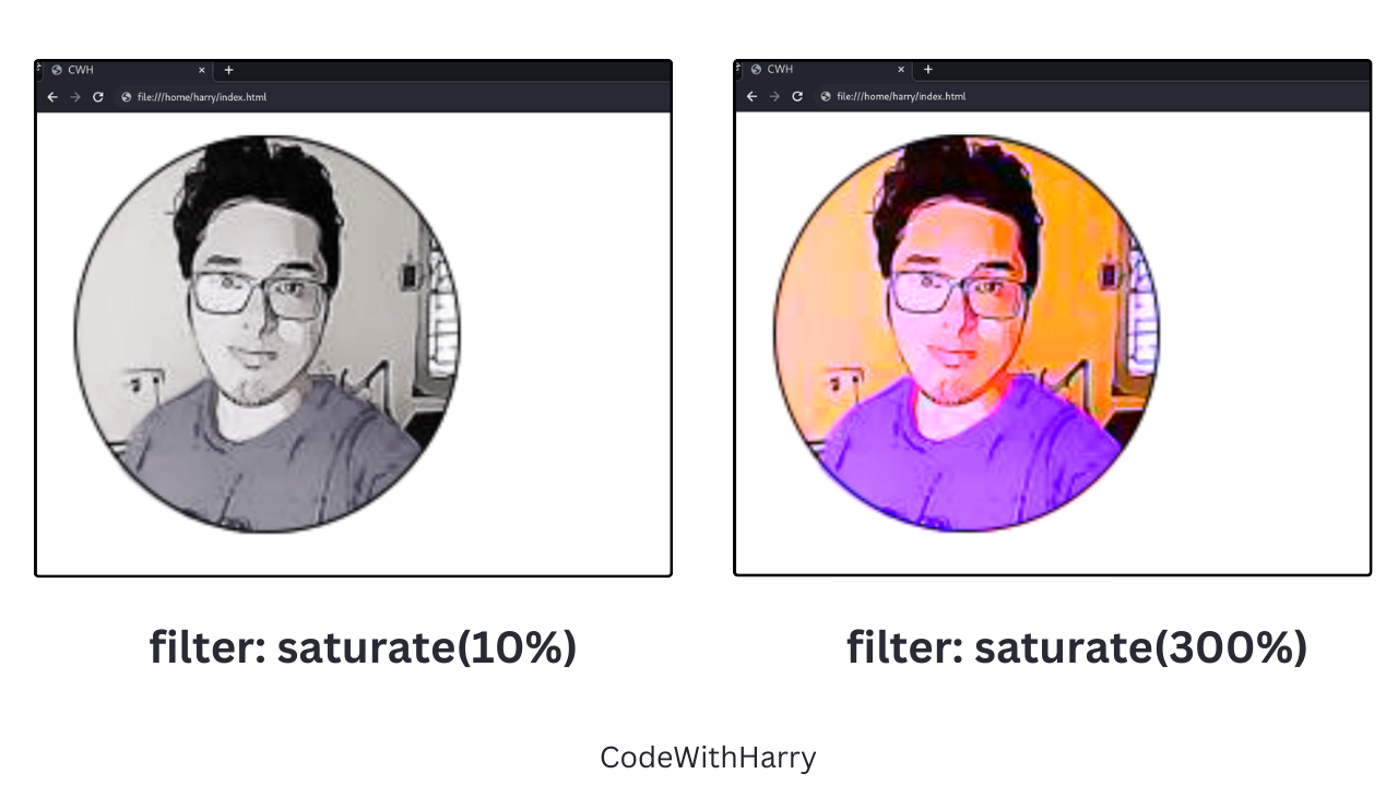
Note: The saturation value is specified in percentages.
Hue-Rotate
The hue rotates the colours of the image.
Example:
img {
filter: hue-rotate(90deg);
}Note: The hue-rotate value is specified in degrees (deg). Positive hue rotation will increase the hue value, while negative hue will decrease the hue value.