Maths Functions
CSS provides several built-in math functions that make it easier to create dynamic and responsive designs. Instead of hardcoding values, you can calculate them on the fly based on context — helping with layouts that adapt to different screen sizes.
The most commonly used CSS math functions are:
calc()min()max()clamp()
calc() Function
The calc() function allows you to perform calculations directly inside CSS properties. You can use addition (+), subtraction (-), multiplication (*), and division (/).
Syntax:
property: calc(expression);This function will automatically subtract 20px from whatever is the 100% width of that container on the website. This way, you can space your elements well without hassles.
Example – Using calc() for spacing
<!DOCTYPE html>
<html>
<head>
<title>CSS calc() Example</title>
<style>
.container {
width: 100%;
background: lightgray;
padding: 10px;
}
.box {
width: calc(100% - 40px); /* 100% width minus 40px */
height: 100px;
background: lightblue;
border: 2px solid navy;
}
</style>
</head>
<body>
<h2>CSS calc() Function</h2>
<div class="container">
<div class="box">Width = 100% - 40px</div>
</div>
</body>
</html>Output:
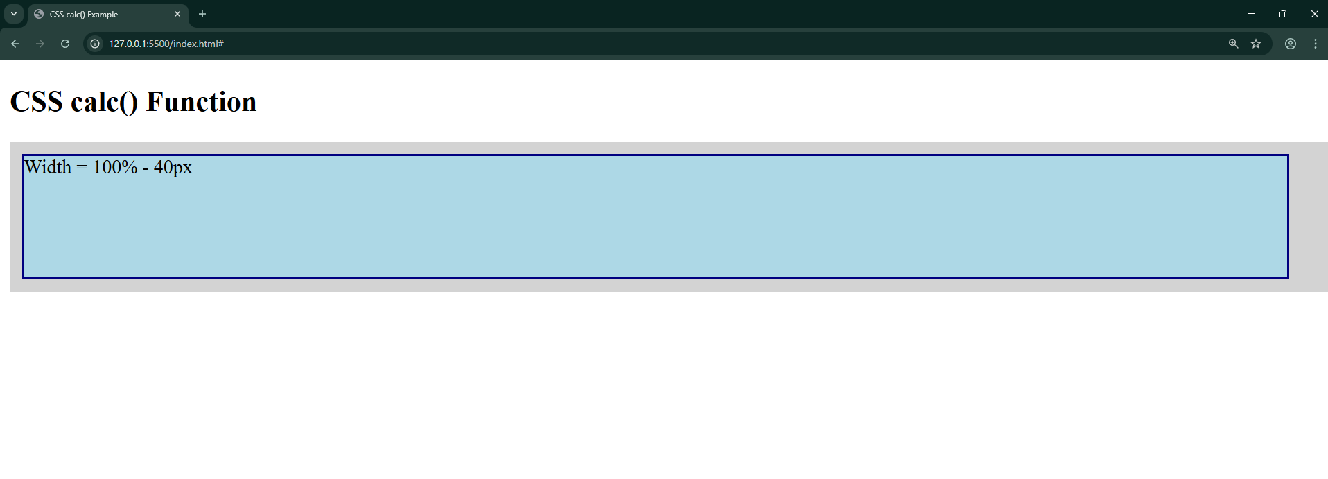
Resize the window — the box automatically adjusts by subtracting 40px.
max() & min() Functions
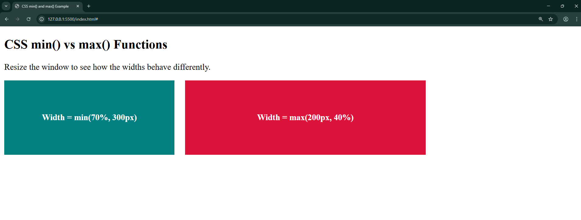
These functions take two parameters and return a result based on one of them accordingly.
Syntax:
width: max(50px, 50%);Out of these two, whichever is greater will be assigned as a value to the width; the opposite happens for the minimum function.
Example:
<!DOCTYPE html>
<html>
<head>
  <title>CSS min() and max() Example</title>
  <style>
    .container {
      display: flex;
      gap: 20px;
      flex-wrap: wrap;
    }

    .box {
      height: 120px;
      padding: 10px;
      color: white;
      font-weight: bold;
      display: flex;
      align-items: center;
      justify-content: center;
    }

    .min-box {
      background: teal;
      width: min(70%, 300px);
      /* Chooses the smaller value: either 70% of container OR 300px */
    }

    .max-box {
      background: crimson;
      width: max(200px, 40%);
      /* Chooses the larger value: either 200px OR 40% of container */
    }
  </style>
</head>
<body>
  <h2>CSS min() vs max() Functions</h2>
  <p>Resize the window to see how the widths behave differently.</p>

  <div class="container">
    <div class="box min-box">Width = min(70%, 300px)</div>
    <div class="box max-box">Width = max(200px, 40%)</div>
  </div>
</body>
</html>
Output:
clamp() Function
The clamp() function is a combination of min and max. It allows you to set a preferred value, but keep it within a minimum and maximum range.
Syntax:
property: clamp(min, preferred, max);
Example – Using clamp()
<!DOCTYPE html>
<html>
<head>
  <title>CSS clamp() Example</title>
  <style>
    .text {
      font-size: clamp(16px, 2vw, 32px);
      /* At least 16px, ideally 2% of viewport width, but max 32px */
      color: darkblue;
    }
  </style>
</head>
<body>
  <h2>CSS clamp() Function</h2>
  <p class="text">This text size adjusts based on screen width.</p>
</body>
</html>
Output:
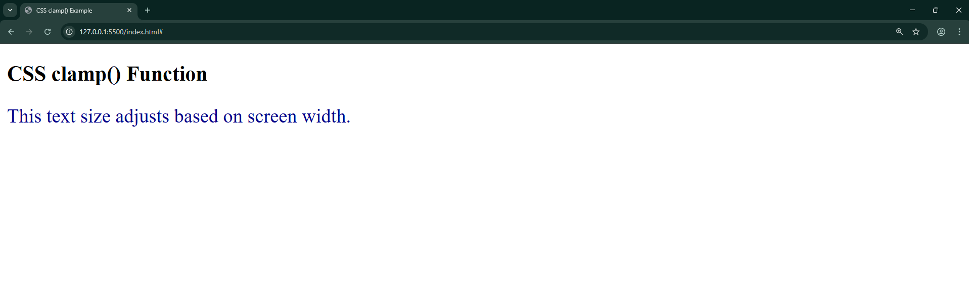
Resize the window — the text grows/shrinks but never goes below 16px or above 32px.
Quick Recap
- calc() → Perform calculations on the fly.
- min() → Selects the smallest value.
- max() → Selects the largest value.
- clamp() → Restricts a value within a flexible range.
These math functions give you more control over responsiveness without writing extra media queries.