Units
We've seen various units in CSS so far used for many different purposes; we did hit and trial to find the correct dimensions of that unit for our website.
In CSS, units help us define the size, spacing, and proportions of elements. Choosing the right unit is crucial for creating consistent and responsive designs.
Units in CSS can be broadly divided into Absolute Units and Relative Units.
Absolute Units
Absolute units are fixed — they do not scale with the screen size or parent element. They are best suited for print layouts, but in web design, we usually avoid them except for pixels (px).
- cm – Centimeters (1 cm = 37.8 px)
- mm – Millimeters (1 mm = 1/10th of 1 cm)
- in – Inches (1 in = 96 px = 2.54 cm)
- pt – Points (1pt = 1/72 in)
- pc – Picas (1pc = 12pt = 1/6 in)
- px – Pixels (1px = 1/96 in) → Most commonly used on screens
Pixels (px) are most widely used because they directly map to screen dots.
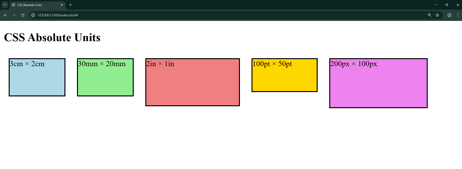
Example - Absolute Units
<!DOCTYPE html>
<html>
<head>
  <title>CSS Absolute Units</title>
  <style>
    .box {
      border: 2px solid black;
      margin: 10px;
      display: inline-block;
    }
    .cm { width: 3cm; height: 2cm; background: lightblue; }
    .mm { width: 30mm; height: 20mm; background: lightgreen; }
    .in { width: 2in; height: 1in; background: lightcoral; }
    .pt { width: 100pt; height: 50pt; background: gold; }
    .px { width: 200px; height: 100px; background: violet; }
  </style>
</head>
<body>
  <h2>CSS Absolute Units</h2>
  <div class="box cm">3cm × 2cm</div>
  <div class="box mm">30mm × 20mm</div>
  <div class="box in">2in × 1in</div>
  <div class="box pt">100pt × 50pt</div>
  <div class="box px">200px × 100px</div>
</body>
</html>
Try resizing the screen — the absolute units do not change.
Output:
Relative Units
Relative units are flexible. They adjust depending on the parent element or the viewport size, making them essential for responsive design.
- em - Relative to the font size of the parent element. Eg: 5em means the size would be 5 times the current font size.
- ex - Relative to X height of the existing font
- ch - Relative to the width/radius of the character “0”.
- rem - Relative to the font size of the root element.
- vw - Relative to 1% of the width of the viewport. (Viewport is the area of the website visible to the user.)
- vh - Relative to 1% of the height of the viewport
- % - Relative to the parent element’s size.
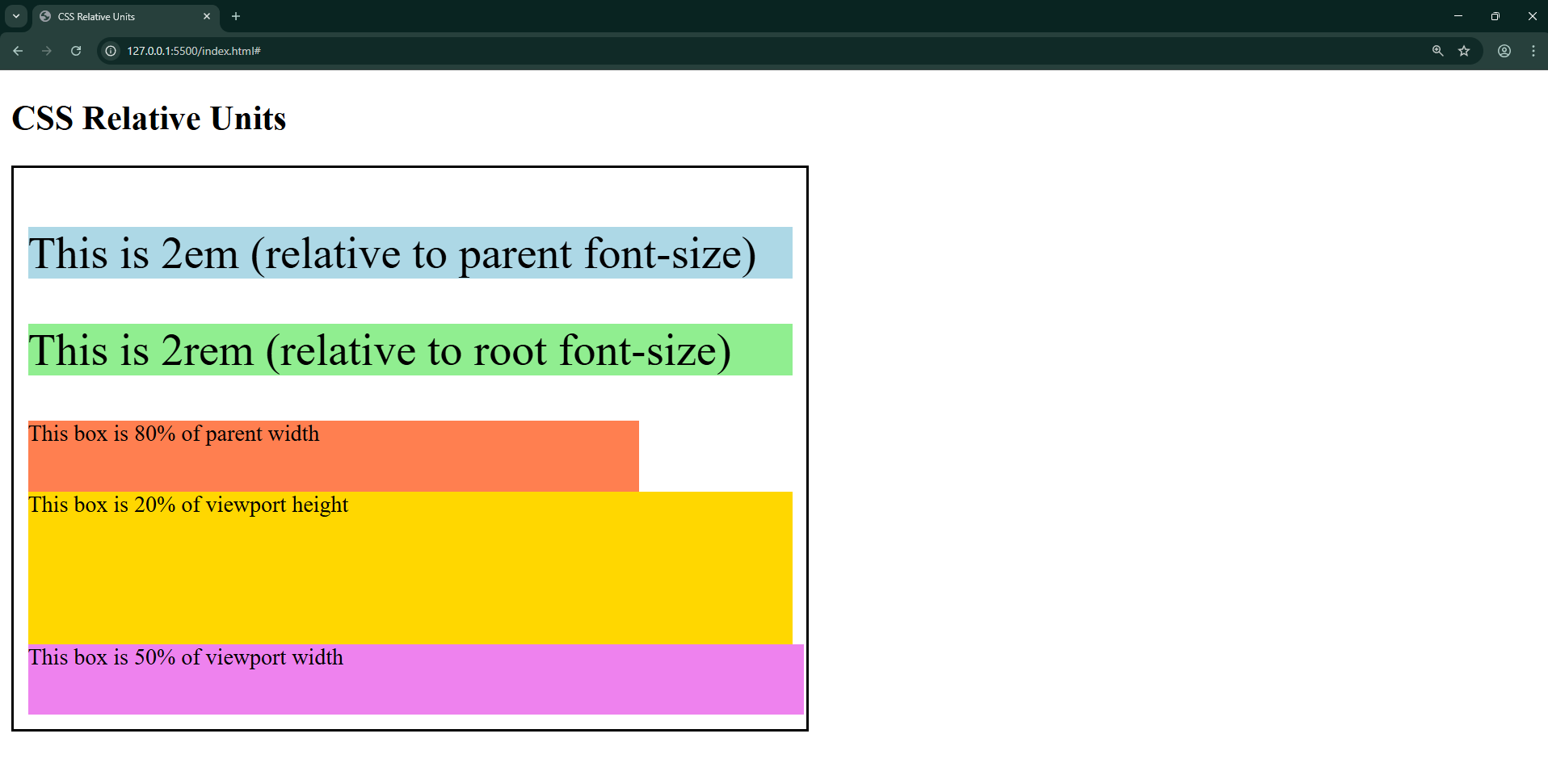
Example – Relative Units
<!DOCTYPE html>
<html>
<head>
  <title>CSS Relative Units</title>
  <style>
    body { font-size: 16px; }
    .parent {
      border: 2px solid black;
      padding: 10px;
      width: 50%;
    }
    .em { font-size: 2em; background: lightblue; }
    .rem { font-size: 2rem; background: lightgreen; }
    .percent { width: 80%; height: 50px; background: coral; }
    .vh { height: 20vh; background: gold; }
    .vw { width: 50vw; background: violet; height: 50px; }
  </style>
</head>
<body>
  <h2>CSS Relative Units</h2>
  <div class="parent">
    <p class="em">This is 2em (relative to parent font-size)</p>
    <p class="rem">This is 2rem (relative to root font-size)</p>
    <div class="percent">This box is 80% of parent width</div>
    <div class="vh">This box is 20% of viewport height</div>
    <div class="vw">This box is 50% of viewport width</div>
  </div>
</body>
</html>
Resize the browser window and see how %, vw, and vh adapt.
Output:
Apart from this, some of the other metrics used in CSS are:
- Opacity: Ranges from 0 to 1
- RGB & RGBA values: 0 to 255
- HSL & HSLA values: 0 to 360
Best Practices
- Use px for pixel-perfect elements (like borders, icons).
- Use rem for scalable typography (consistent across site).
- Use % / vh / vw for responsive layouts.
- Avoid cm, mm, in, pt, pc in web — they’re better for print.