Buttons
Buttons are an essential part of any website—they allow users to interact with forms, navigate pages, or trigger actions. A well-designed button not only looks good but also improves the overall user experience.
With CSS, we can transform a plain HTML button into something eye-catching that matches the theme of our website.
Basic Button Example
<button>Click Me</button>
Without styling, this will look like a standard browser button. Let’s apply some CSS to make it better.
Adding Basic Styles
button {
    background-color: royalblue;
    color: white;
    padding: 10px 20px;
    border: none;
    border-radius: 5px;
    font-size: 16px;
    cursor: pointer;
}
Output
A smooth, clickable button with a blue background and rounded corners.
Hover Effects
To make buttons more interactive, we often use the :hover pseudo-class. This lets us change the appearance when the user moves the mouse over the button.
button:hover {
    background-color: dodgerblue;
}
Now, the button gets a lighter blue when hovered—giving instant feedback to the user.
Active & Focus States
We can also style active (when clicked) and focus (when tabbed into) states:
button:active {
    background-color: navy;
}

button:focus {
    outline: 2px solid orange;
}
- Active: Darker shade when clicked.
- Focus: Orange outline when the button is selected using the keyboard.
Complete Code:
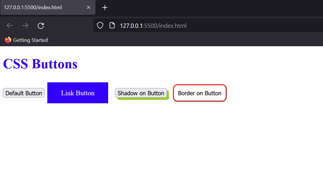
<!DOCTYPE html>
<html lang="en">
<head>
    <meta charset="UTF-8">
    <title>CSS Buttons</title>
    <style>
        .button1 {
            background-color: #3300ff;
            color: white;
            padding: 15px 32px;
            text-align: center;
            text-decoration: none;
            display: inline-block;
            font-size: 16px;
            margin: 4px 2px;
            cursor: pointer;
        }

        .button2 {
            box-shadow: 5px 5px yellowgreen;
            margin: 10px;
        }

        .button3 {
            padding: 10px;
            background-color: white;
            border: 1px solid red;
            border-radius: 10px;
        }
    </style>
</head>
<body>
    <h1 style="color: #3300ff">CSS Buttons</h1>
    <button>Default Button</button>
    <a href="#" class="button1">Link Button</a>
    <button class="button2">Shadow on Button</button>
    <button class="button3">Border on Button</button>
</body>
</html>
Output:
Quick Recap
- CSS lets you customize buttons to match your website’s theme.
- Use padding, background, border, and border-radius for basic styling.
- Add hover, focus, and active effects for interactivity.
- Explore advanced styles like outline, gradient, shadows, and rounded buttons.