Positioning
The CSS position property allows you to control how and where elements are placed on a web page. It defines whether an element should follow the natural flow of the document or be positioned at a specific spot using coordinates like top, right, bottom, and left.
Positioning is one of the most powerful features in CSS because it lets you create layouts, fixed headers, sticky navigation bars, tooltips, modals, and much more.
Syntax
selector {
    position: value;
    top: 10px;
    left: 20px;
}
Possible Values:
- static → Default positioning (normal document flow).
- relative → Positioned relative to its normal position.
- absolute → Positioned relative to the nearest positioned ancestor.
- fixed → Positioned relative to the viewport (stays fixed while scrolling).
- sticky → Acts like relative until a scroll threshold is reached, then “sticks” like fixed.
1. Static (Default)
By default, all elements have position: static;. They follow the normal document flow without any special positioning.
Syntax:
selector {
position: static;
}Example:
<!DOCTYPE html>
<html lang="en">
<head>
<meta charset="UTF-8">
<meta name="viewport" content="width=device-width, initial-scale=1.0">
<title>CSS Position Static Example</title>
<style>
img {
position: static; /* Default value */
width: 100px;
}
</style>
</head>
<body>
<p id="p1">This is paragraph 1</p>
<p id="p2">This is paragraph 2</p>
<img src="./logo.png" alt="logo">
<p id="p3">This is paragraph 3</p>
<p id="p4">This is paragraph 4</p>
</body>
</html>
Output:
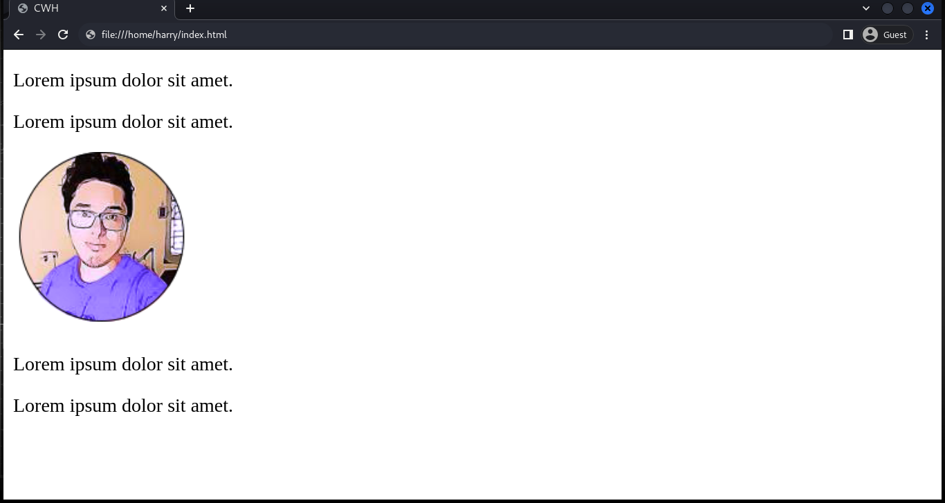 Elements just stay where they naturally appear.
2. Relative
Elements are positioned relative to the normal position in the document.
You can use the top, right, bottom, and left properties to move the element from its original position.
Syntax:
selector {
position: relative;
}Example:
<!DOCTYPE html>
<html lang="en">
<head>
<meta charset="UTF-8">
<meta name="viewport" content="width=device-width, initial-scale=1.0">
<title>CSS Position Relative Example</title>
<style>
img {
position: relative;
left: 100px; /* Move 100px right */
top: 50px; /* Move 50px down */
width: 100px;
}
</style>
</head>
<body>
<p>This is paragraph 1</p>
<p>This is paragraph 2</p>
<img src="./logo.png" alt="logo">
<p>This is paragraph 3</p>
<p>This is paragraph 4</p>
</body>
</html>Output:
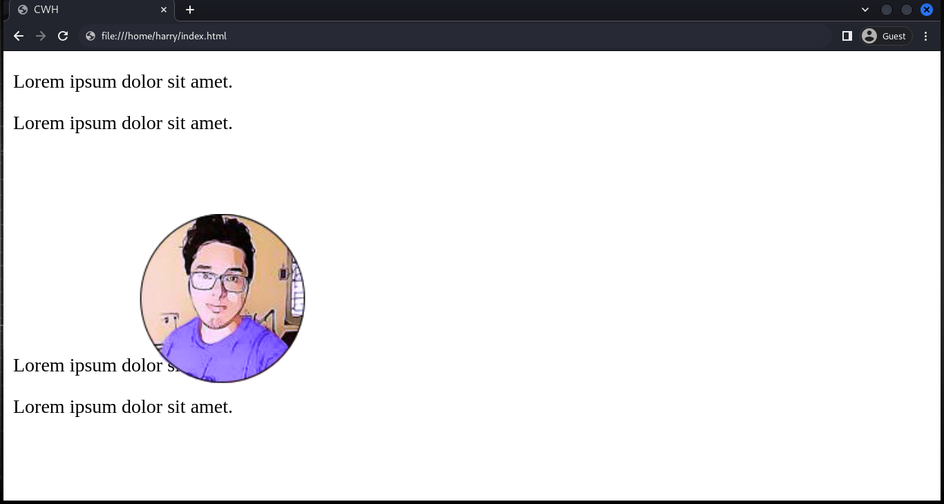
Here you can see that the image is repositioned from its original place, and the gap is not filled by another element.
3. Absolute
Elements are positioned relative to the closest positioned ancestor (parent), which means we need to have a parent element with a positioning other than 'static'.
Note: An absolutely positioned element is removed from the normal flow.
Example:
<!DOCTYPE html>
<html lang="en">
<head>
<meta charset="UTF-8">
<meta name="viewport" content="width=device-width, initial-scale=1.0">
<title>CSS Position Absolute Example</title>
<style>
.container {
position: relative; /* Acts as reference for absolute child */
border: 2px solid #333;
padding: 40px;
height: 200px;
}
.logo {
position: absolute;
right: 10px;
top: 10px;
width: 80px;
}
</style>
</head>
<body>
<h1>CodeWithHarry</h1>
<div class="container">
<p>Developer</p>
<p>Founder of CodeWithHarry</p>
<img class="logo" src="./logo.png" alt="logo">
</div>
</body>
</html>
Output:
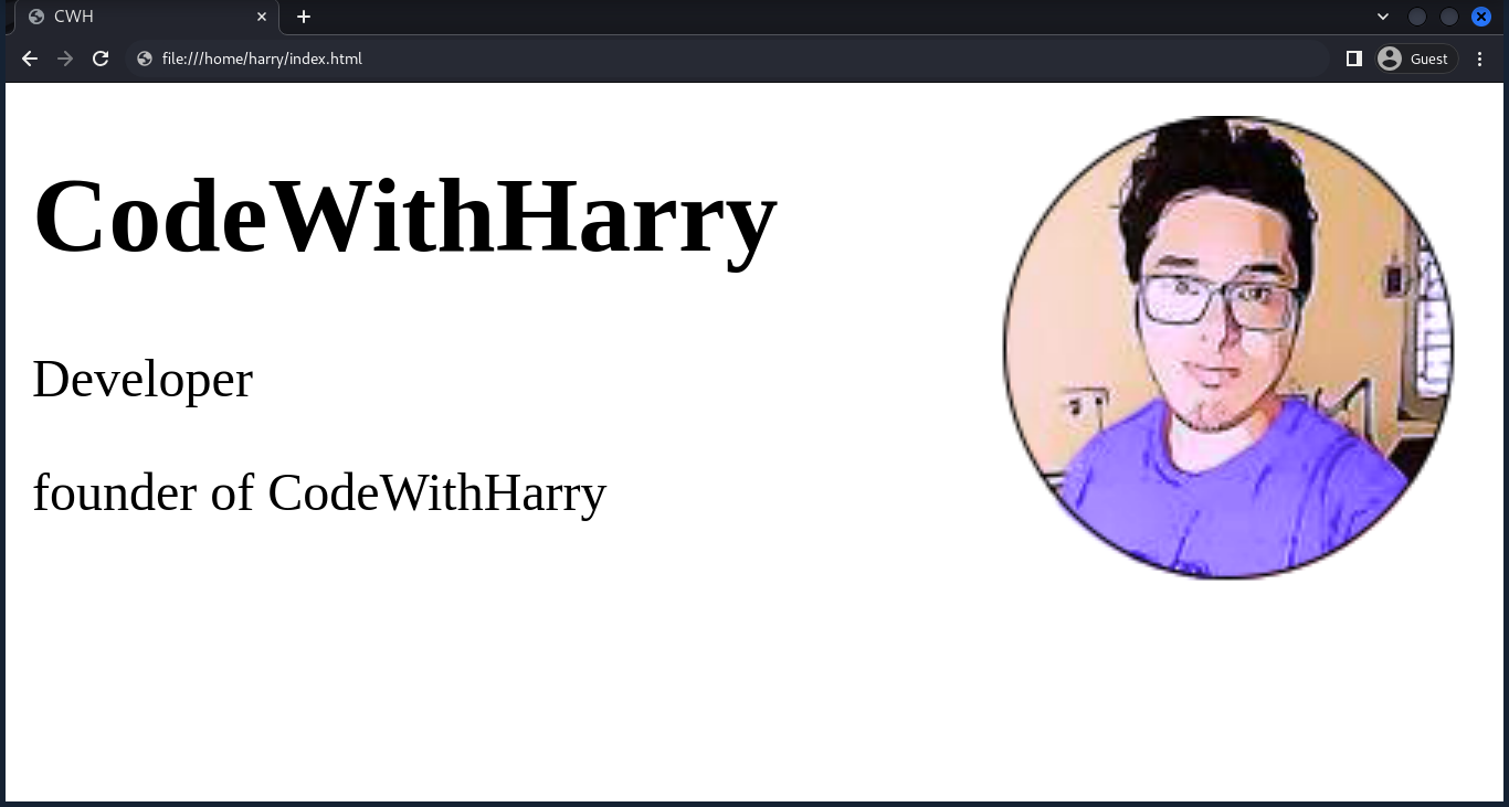
Explanation:
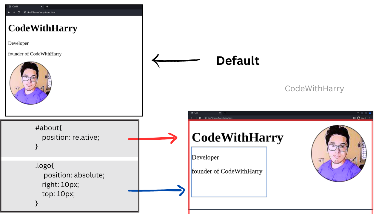
Here, as we have set position relative to the body and absolute to the about section, the about section position can be manipulated with the left of top, left, right, and bottom.
4. Fixed
An element with position: fixed; is positioned relative to the viewport (the screen itself). It does not move when the page is scrolled.
This is useful for creating elements like fixed headers or footers.
Example:
<!DOCTYPE html>
<html lang="en">
<head>
<style>
h1 {
position: fixed;
top: 10px;
right: 20px;
background: yellow;
}
</style>
</head>
<body>
<h1>CodeWithHarry</h1>
<p>Scroll down to see the effect...</p>
<p style="margin-top:1000px;">End of page</p>
</body>
</html>Output:
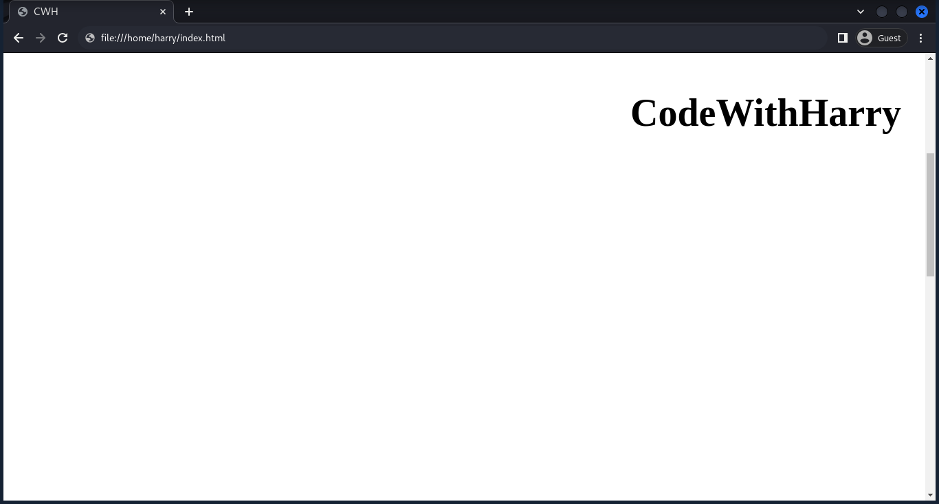
The heading remains visible even when scrolling.
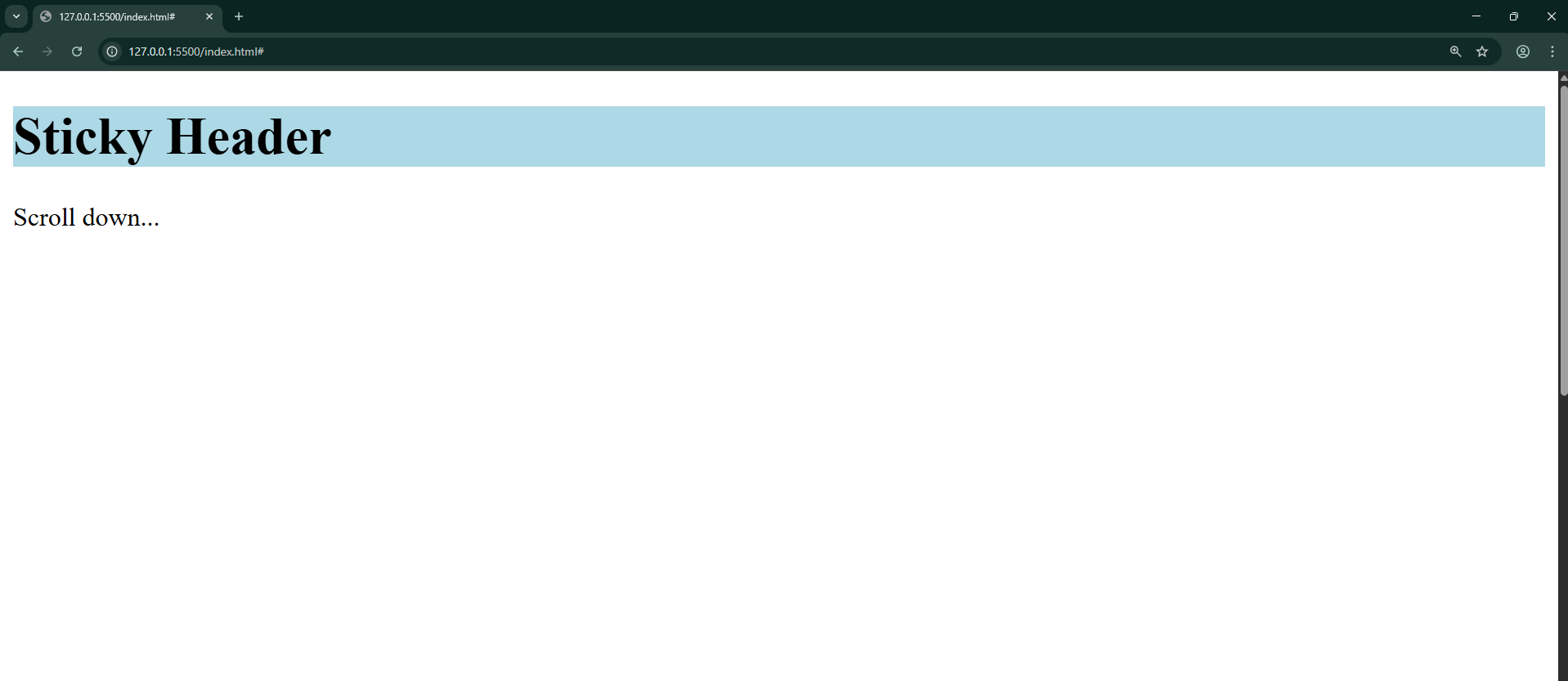
5. Sticky
Position sticky is a hybrid between 'relative' and 'fixed'.
It allows an element to become "stuck" to the top or bottom of its container when scrolling, but it behaves like relative positioning within the container until it reaches a specified offset.
Example:
<!DOCTYPE html>
<html lang="en">
<head>
<style>
h1 {
position: sticky;
top: 0;
background: lightblue;
}
</style>
</head>
<body>
<h1>Sticky Header</h1>
<p>Scroll down...</p>
<p style="margin-top:1000px;">End of page</p>
</body>
</html>Output:
Float
Although not a position value, the float property is often used alongside positioning to wrap text around images. For more details, follow CSS Float.
Quick Recap
- Static → Default (normal flow).
- Relative → Moves element relative to its original spot.
- Absolute → Positioned relative to nearest ancestor with positioning.
- Fixed → Stays fixed to the viewport, even on scroll.
- Sticky → Behaves like relative until a threshold is reached, then sticks.
- Float → Used for text wrapping (not an actual position type).