Borders
Borders in CSS help define the visual boundaries of HTML elements such as <div>, <p>, <h1>, or even inline elements like <span> With borders, you can enhance the look of your web page by adding outlines, styles, and shapes around elements.
CSS provides several properties to customize borders, such as style, color, width, radius, and more. Let’s go through them step by step.
Border Style
Border styles define the style of the border.
There are various types of border styles; consider the code snippet:
<html lang="en">
<head>
<style>
.none {
border-style: none;
}
.hidden {
border-style: hidden;
}
.dotted {
border-style: dotted;
}
.dashed {
border-style: dashed;
}
.solid {
border-style: solid;
}
.double {
border-style: double;
}
.groove {
border-style: groove;
}
.ridge {
border-style: ridge;
}
.inset {
border-style: inset;
}
.outset {
border-style: outset;
}
</style>
</head>
<body>
<p class="none">no border</p>
<p class="hidden">Hidden Border</p>
<p class="dotted">Dotted Border</p>
<p class="dashed">Dashed Border</p>
<p class="solid">Solid border</p>
<p class="double">Double Border</p>
<p class="groove">Groove border</p>
<p class="ridge">ridge border</p>
<p class="inset">inset border</p>
<p class="outset">Outset Border</p>
</body>
</html>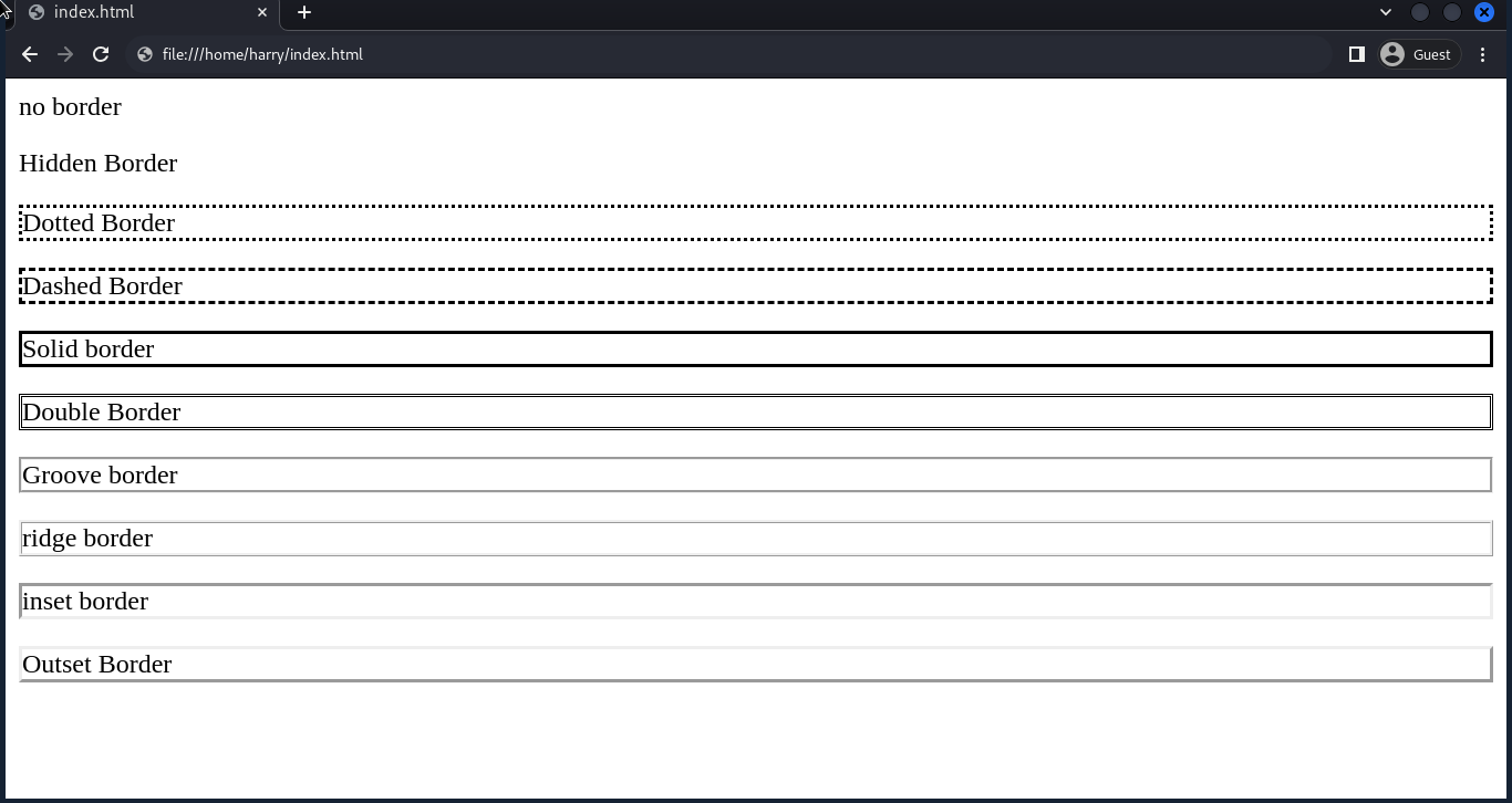
Border Color
The border color property sets the colour of the border. We can use colour name, hex, rgb, or hsl to set the color.
If you are not familiar with CSS colours, then follow the CSS Color Tutorial.
Consider the code snippet:
<html lang="en">
<head>
<style>
.dotted {
border-style: dotted;
color: purple;
}
.dashed {
border-style: dashed;
border-color: #FF0000;
}
.solid {
border-style: solid;
border-color: rgb(100, 233, 12);
}
.double {
border-style: double;
border-color: hsl(10, 50, 30);
}
</style>
</head>
<body>
<p class="dotted">Dotted Border</p>
<p class="dashed">Dashed Border</p>
<p class="solid">Solid border</p>
<p class="double">Double Border</p>
</body>
</html>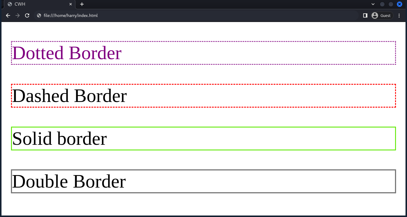
Border Width
Specifies the width of the border. Sets the width of the border in pixels(px), or there are values like medium, thin, and thick to set the border width.
Consider the code snippet:
<html lang="en">
<head>
<style>
.solid1 {
border-width: 5px;
border-style: solid;
border-color: red;
}
.solid2 {
border-width: thin; /* thin || medium || thick */
border-style: solid;
border-color: #FF0000;
}
</style>
</head>
<body>
<p class="solid1">Solid border 1</p>
<p class="solid2">Solid border 2</p>
</body>
</html>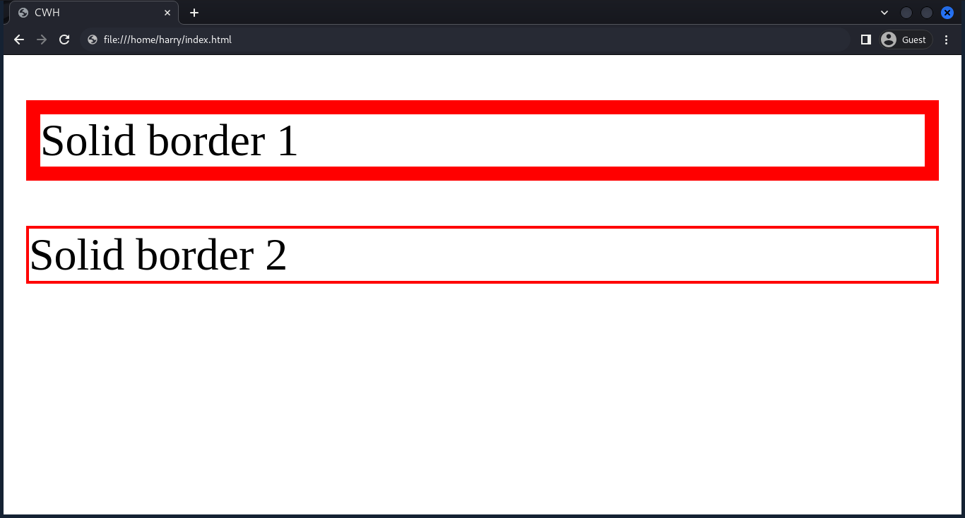
Border Radius
Border radius helps create rounded borders for elements like buttons or images.
<html lang="en">
<head>
<style>
.solid1 {
border-radius: 20px;
border-style: solid;
border-color: red;
}
.solid2 {
border-radius: 25%;
border-style: solid;
border-color: #FF0000;
}
</style>
</head>
<body>
<p class="solid1">Solid border 1</p>
<p class="solid2">Solid</p>
</body>
</html>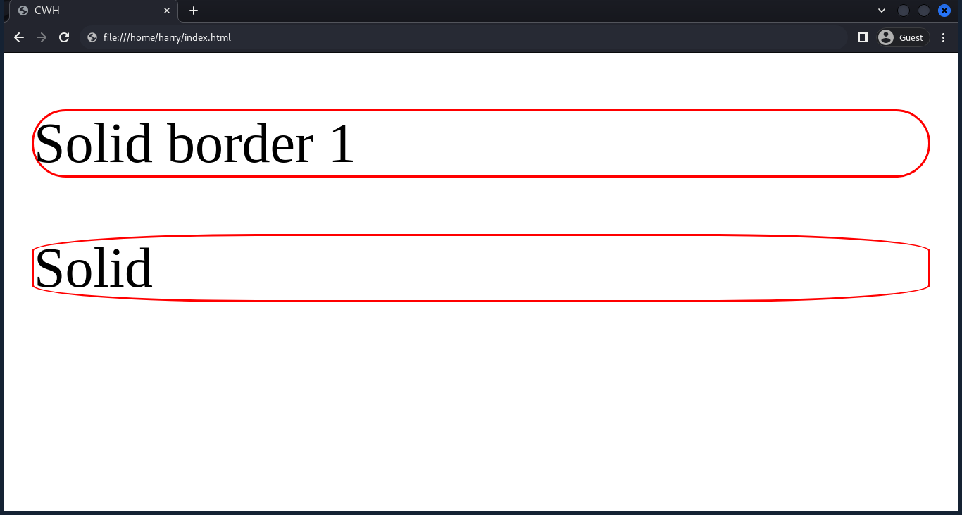
We can also set border-radius to each individual edge (specific corners), such as top left, bottom right, top right, and bottom left.
Set the border of individual corners
Syntax:
selector {
border-radius: 10px 5px 15px 35px ;
/* border-radius: top-left top-right bottom-right bottom-left ; */
}or
selector {
border-top-left-radius: 10px;
border-top-right-radius: 5px;
border-bottom-right-radius: 15px;
border-bottom-left-radius: 35px;
}Border Collapse
While working with tables, border-collapse helps to control how table borders interact with each other.
There are two properties of border-collapse.
Collapse
Syntax:
selector {
border-collapse: collapse;
}
Separate
Syntax:
selector {
border-collapse: separate;
}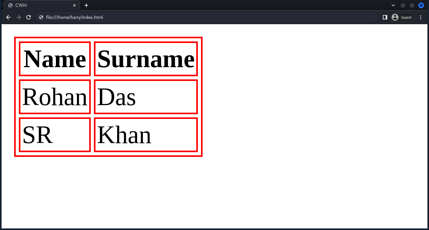
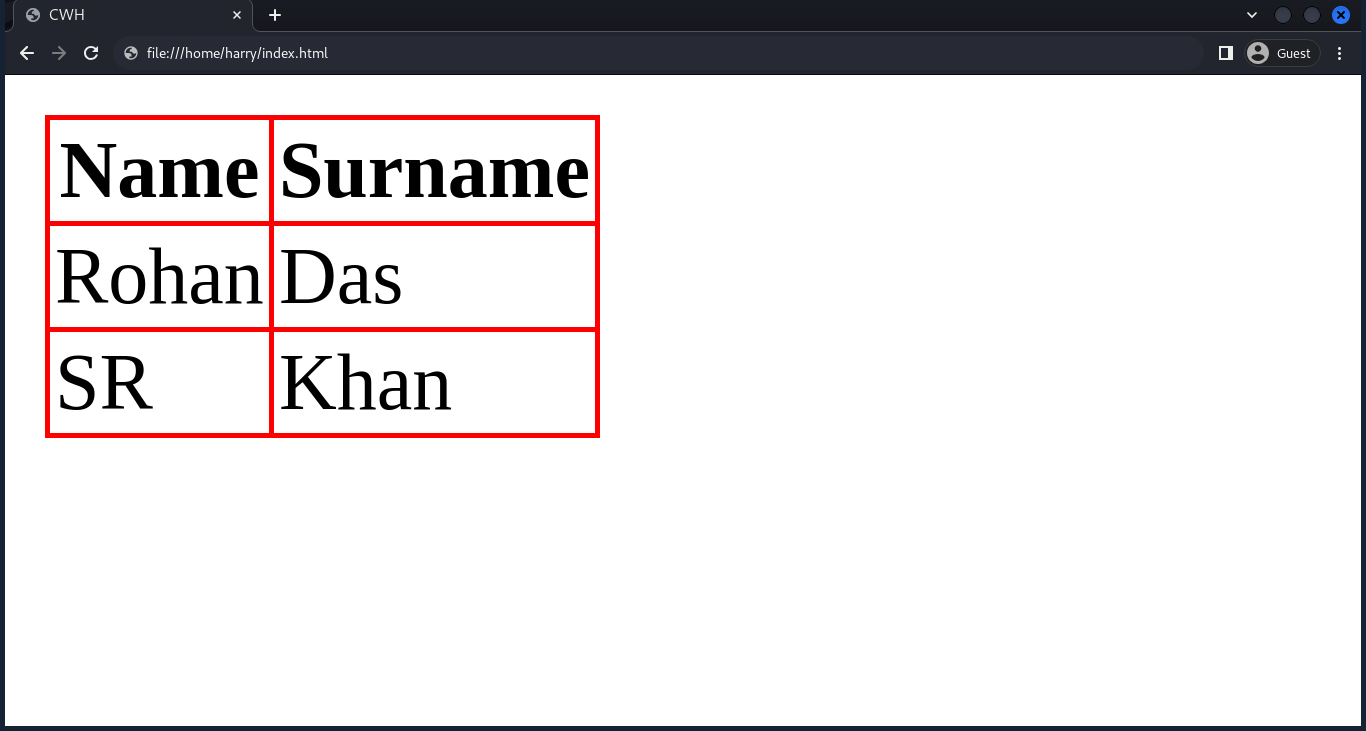
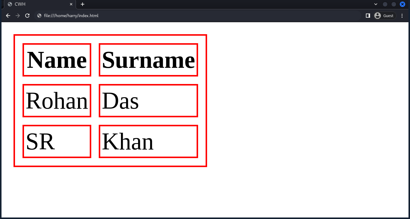
Border Spacing
While working with tables, border-spacing helps define the space between the borders of adjacent table cells.
selector {
border-spacing: 5px;
}
Shorthand
Border shorthand takes three properties: width, style, and color.
Syntax:
selector {
border: width style color;
}Example:
<html lang="en">
<head>
<style>
p {
border: 2px solid red;
}
</style>
</head>
<body>
<p>Hello world, I'm CodeWithHarry</p>
</body>
</html>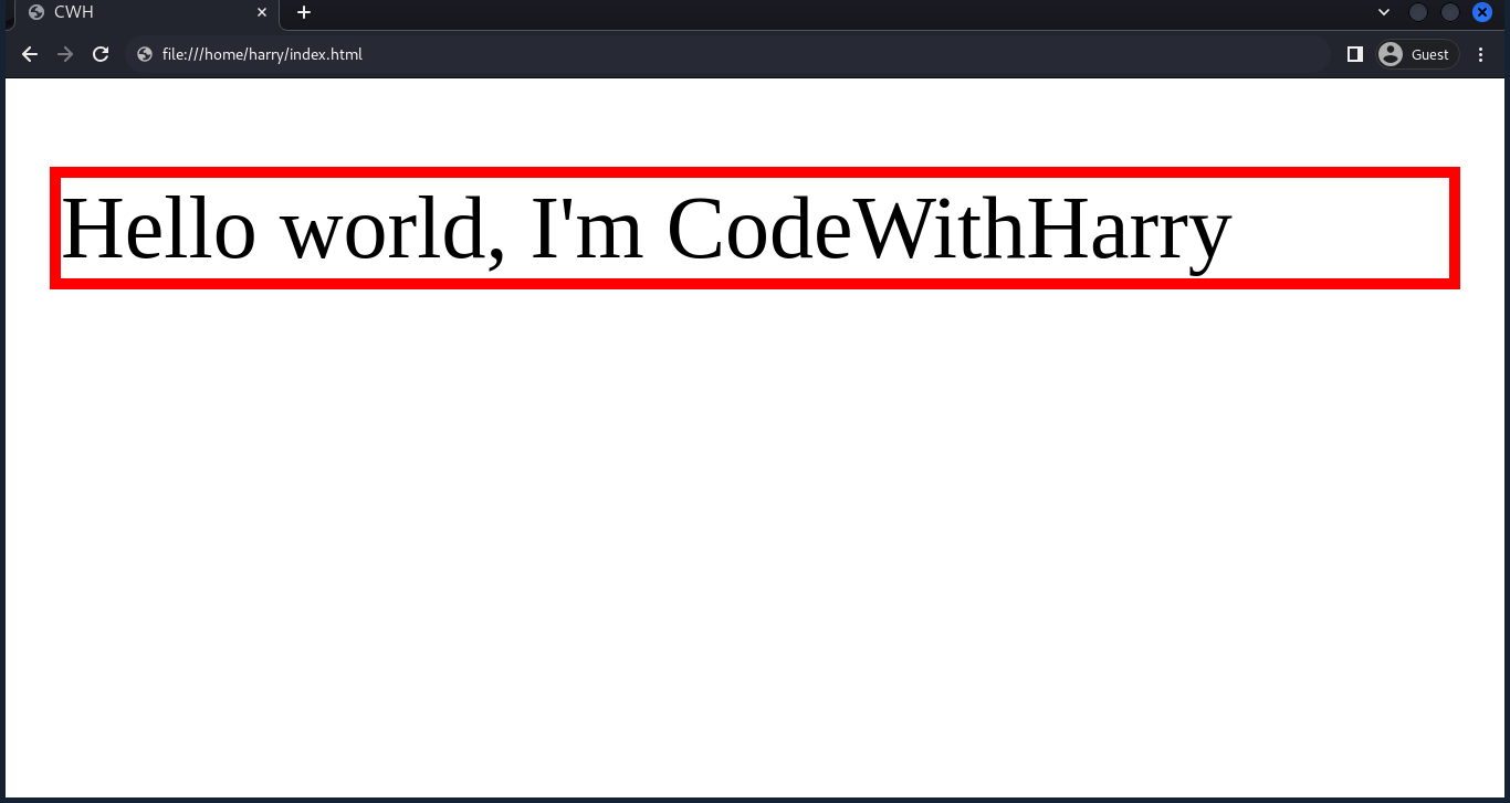
Quick Summary
- Border Style → Defines how the border looks (dotted, solid, dashed, etc.).
- Border Color → Sets the color of the border.
- Border Width → Adjusts the thickness of the border.
- Border Radius → Rounds corners for smooth edges.
- Border Collapse → Merges or separates table borders.
- Border Spacing → Adds gaps between table cells.
- Shorthand → Quickly sets border width, style, and color in one line.
Borders are a fundamental CSS property that help make elements stand out and improve visual design. You’ll use them often when styling buttons, cards, tables, and layouts.