Text Styling
Text styling in CSS allows you to control how text appears on your web pages. With a few properties, you can decorate text, control its alignment, transform its case, adjust spacing, and even add effects like shadows.
Let’s go through the most commonly used text styling properties.
Text Decoration
The text-decoration property adds various types of text decorations.
Syntax:
selector {
text-decoration: value;
}There are four values for text-decoration:
- overline: adds a line above the text
- underline: adds a line below the text
- line-through: adds a line through the text.
- none: to remove decoration.
Example:
<html lang="en">
<head>
<style>
#p1 {text-decoration: overline;}
#p2 {text-decoration: underline;}
#p3 {text-decoration: line-through;}
#p4 {text-decoration: overline underline;}
</style>
</head>
<body>
<p id="p1">text-decoration: overline</p>
<p id="p2">text-decoration: underline</p>
<p id="p3">text-decoration: line-through</p>
<p id="p4">text-decoration: overline underline</p>
</body>
</html>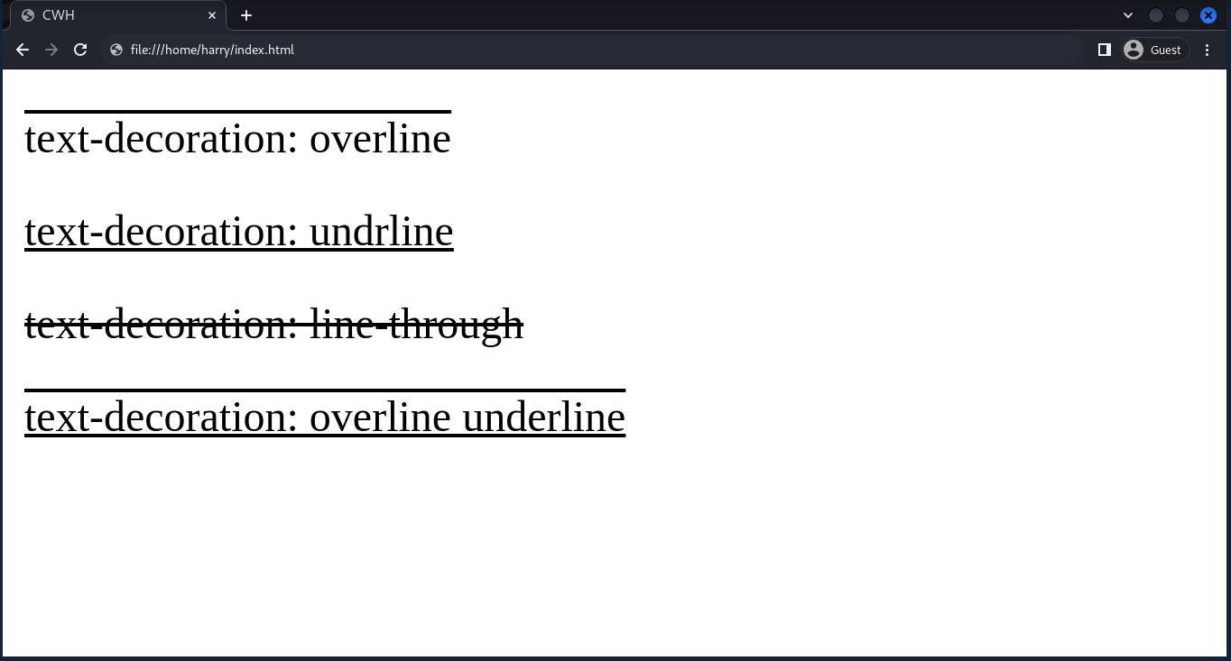
Text Alignment
The text-align property is used to align the text within the container. The container can be a div, section, etc.
Syntax:
selector {
text-align: value;
}There are four values for text-align:
- left: align the text to the left.
- center: align the text to the center.
- right: align the text to the right.
- justify: spread the text evenly between the left and right margins.
Example:
<html lang="en">
<head>
<style>
#p1 {text-align: left;}
#p2 {text-align: right;}
#p3 {text-align: end;}
#p4 {text-align: justify;}
</style>
</head>
<body>
<p id="p1">text-align: left</p>
<p id="p2">text-align: right</p>
<p id="p3">text-align: end</p>
<p id="p4">text-align: justify</p>
</body>
</html>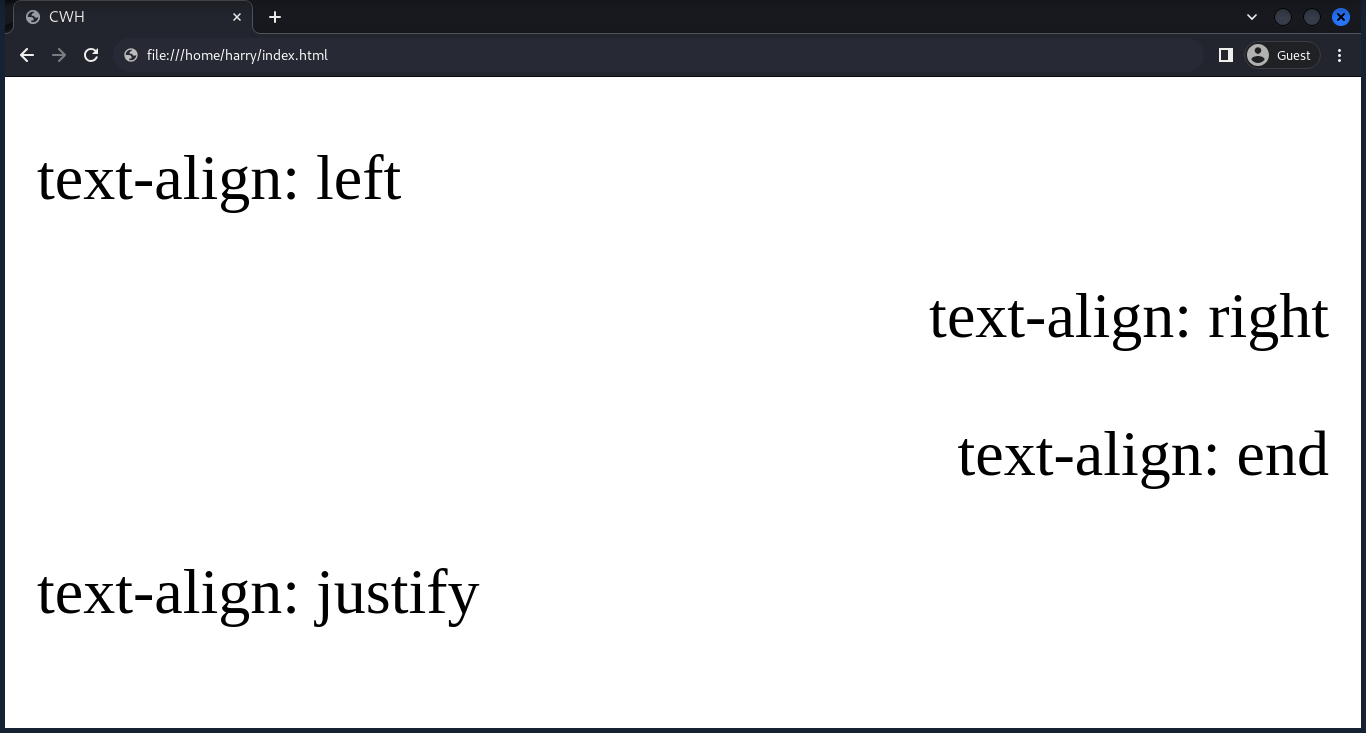
Text Transformation
The text-transform property changes the case of the text.
Syntax:
selector {
text-transform: value;
}There are four values for text-transform:
- uppercase: transform text to uppercase (all capital letters).
- lowercase: transform text to lowercase (all small letters).
- capitalize: capitalize the first character of each word.
- none: to remove text transformation.
Example:
<html lang="en">
<head>
<style>
#p1 {text-transform: uppercase;}
#p2 {text-transform: lowercase;}
#p3 {text-transform: capitalize;}
#p4 {text-transform: none;}
</style>
</head>
<body>
<p id="p1">text-transform: uppercase</p>
<p id="p2">text-transform: lowercase</p>
<p id="p3">text-transform: capitalize</p>
<p id="p4">text-transform: none</p>
</body>
</html>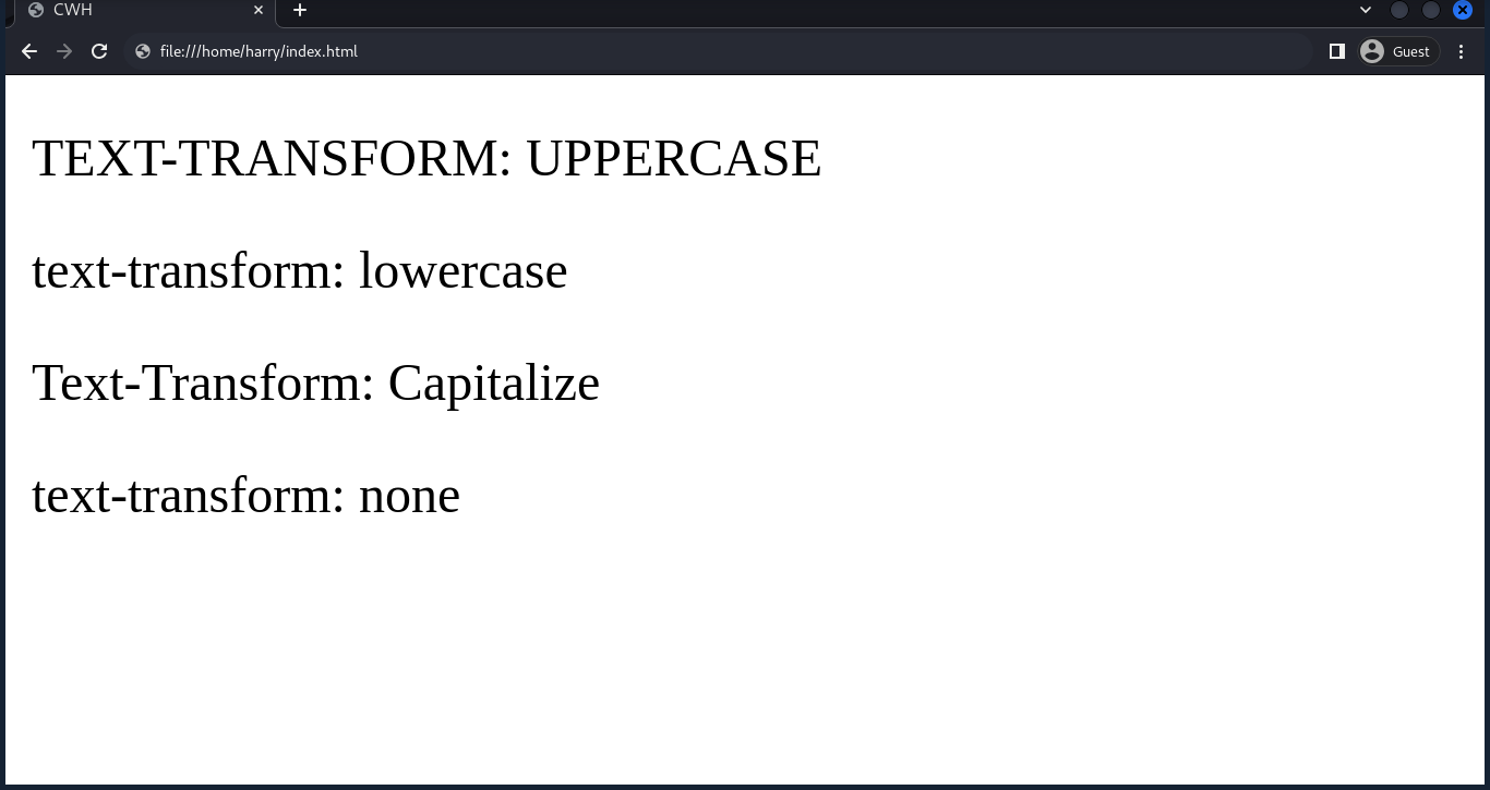
Letter Spacing
The letter-spacing property allows you to specify the spacing between each character in the text. The property values can be in pixels (px), em, rem, percentage (%), etc.
Example:
<html lang="en">
<head>
<style>
h1 {
letter-spacing: 5px;
}
</style>
</head>
<body>
<h1>CodeWithHarry</h1>
</body>
</html>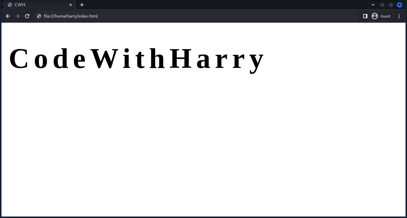
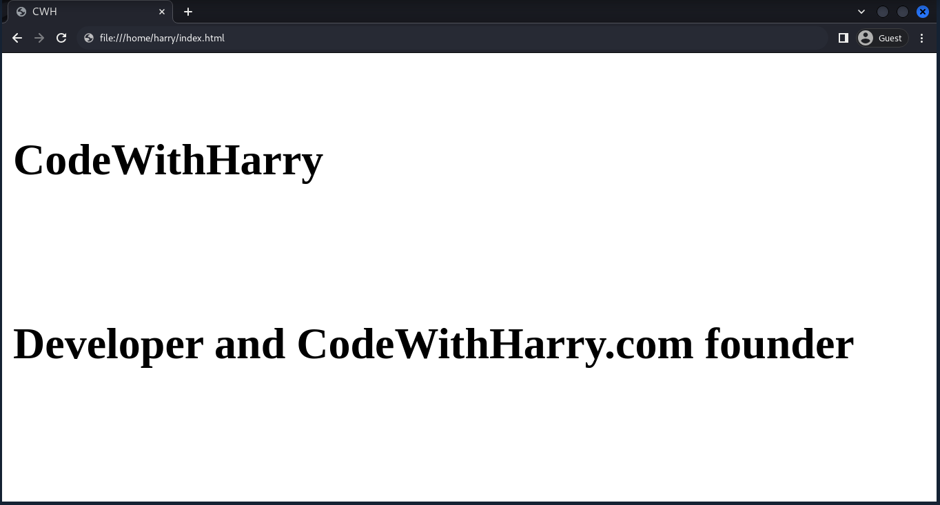
Line Height
The line-height property defines the vertical spacing between lines of text.
Example:
<html lang="en">
<head>
<style>
h1 {
line-height: 3.5;
}
</style>
</head>
<body>
<h1>CodeWithHarry</h1>
<h1>Developer and CodeWithHarry.com founder</h1>
</body>
</html>Here, a value of 3.5 means the space between lines will be 3.5 times the font size.
Text Shadow
The text-shadow property adds a shadow effect to text.
Syntax:
selector {
text-shadow: horizontal offset, vertical offset, blur radius, color;
}Example:
<html lang="en">
<head>
<style>
h1 {
text-shadow: 2px 3px 4px red;
}
</style>
</head>
<body>
<h1>CodeWithHarry</h1>
</body>
</html>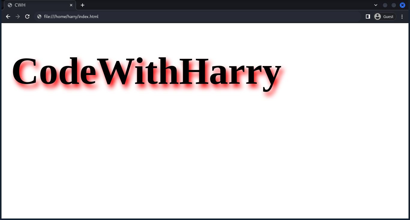
Text Overflow
The text-overflow property controls how overflowing text is handled inside a container.
There are two values we can use with text-overflow:
- ellipsis: truncates overflowing text with an ellipsis.
- clip: clips the text without any visual indication.
Example:
p {
    white-space: nowrap;
    overflow: hidden;
    text-overflow: ellipsis;
}