Grid
Just like FlexBox, CSS Grid with the use of rows and columns, makes it easier to style website elements.
CSS Grid Layout is a two-dimensional layout system that allows you to create complex web designs using both rows and columns. Unlike Flexbox, which is one-dimensional (either row or column), Grid lets you work in both dimensions simultaneously.
- To use Grid, simply set
display: grid;(ordisplay: inline-grid;for inline grids) on a container. The child elements within this container become grid items, and you control their placement using various grid properties.
Grid Container Properties
These properties apply to the parent element (the grid container) that holds all grid items. The container defines the structure of the layout.
1. grid-template-columns & grid-template-rows
These properties define the number of columns and rows in the grid, along with their sizes.
grid-template-columnscontrols the columns.grid-template-rowscontrols the rows.
You can use different units like px, em, %, fr (fractional unit), or auto to define the size.
Example:
<!DOCTYPE html>
<html lang="en">
<head>
<meta charset="UTF-8">
<meta name="viewport" content="width=device-width, initial-scale=1.0">
<title>CSS Grid - Columns & Rows</title>
<style>
.grid-container {
display: grid;
grid-template-columns: 1fr 2fr 1fr; /* 3 columns, the middle column is twice as wide */
grid-template-rows: 100px auto; /* 2 rows: first row fixed at 100px, second row auto-sized */
gap: 10px;
background-color: #4CAF50;
padding: 10px;
}
.grid-item {
background-color: rgba(255,255,255,0.8);
border: 1px solid #333;
text-align: center;
padding: 20px;
font-size: 20px;
}
</style>
</head>
<body>
<h2>Grid with 3 Columns and 2 Rows</h2>
<div class="grid-container">
<div class="grid-item">1</div>
<div class="grid-item">2</div>
<div class="grid-item">3</div>
<div class="grid-item">4</div>
<div class="grid-item">5</div>
<div class="grid-item">6</div>
</div>
</body>
</html>Output:
The grid will have 3 columns with the middle one being twice as wide as the others, and 2 rows where the first row has a fixed height of 100px, and the second row adjusts automatically.
2. gap (row-gap & column-gap)
The gap property adds spacing between grid items. It can also be defined individually as row-gap (spacing between rows) and column-gap (spacing between columns).
gap: 20px; /* sets both row and column gap */
row-gap: 10px; /* only row gap */
column-gap: 30px; /* only column gap */3. grid-template-areas
grid-template-areas allows you to visually define the structure of your grid by naming different areas. This approach is useful for creating layout grids like those found in websites with distinct sections (header, sidebar, footer, etc.).
Example: Webpage Layout
<!DOCTYPE html>
<html lang="en">
<head>
<meta charset="UTF-8">
<meta name="viewport" content="width=device-width, initial-scale=1.0">
<title>CSS Grid - Areas</title>
<style>
.layout {
display: grid;
grid-template-areas:
"header header header"
"menu main aside"
"footer footer footer";
grid-template-columns: 1fr 3fr 1fr;
grid-template-rows: auto auto auto;
gap: 10px;
}
.header { grid-area: header; background: lightblue; padding: 20px; text-align: center; }
.menu { grid-area: menu; background: lightgreen; padding: 20px; }
.main { grid-area: main; background: lightyellow; padding: 20px; }
.aside { grid-area: aside; background: lightpink; padding: 20px; }
.footer { grid-area: footer; background: lightgray; padding: 20px; text-align: center; }
</style>
</head>
<body>
<h2>Web Page Layout using Grid</h2>
<div class="layout">
<div class="header">Header</div>
<div class="menu">Menu</div>
<div class="main">Main Content</div>
<div class="aside">Sidebar</div>
<div class="footer">Footer</div>
</div>
</body>
</html>Output:
The layout will show a Header at the top, Menu on the left, Main Content in the center, Sidebar on the right, and Footer at the bottom.
Grid Item Properties
These properties apply to individual grid items, allowing you to control their placement and size within the grid.
1. grid-column
Defines how many columns a grid item should span. You can specify a start and end position.
grid-column: start / end; /* Start and end are the grid line numbers */You can also use the span keyword to specify how many columns the item should span:
grid-column: span 2; /* Item will span across 2 columns */Example: Spanning Columns
<!DOCTYPE html>
<html lang="en">
<head>
<meta charset="UTF-8">
<meta name="viewport" content="width=device-width, initial-scale=1.0">
<title>CSS Grid - Column Span</title>
<style>
.grid-container {
display: grid;
grid-template-columns: 1fr 1fr 1fr;
gap: 10px;
background: lightseagreen;
padding: 10px;
}
.grid-item {
background: white;
border: 1px solid #333;
padding: 20px;
text-align: center;
}
.span-columns {
grid-column: 1 / 3; /* Span across 2 columns */
background: lightblue;
}
</style>
</head>
<body>
<h2>Grid Column Span</h2>
<div class="grid-container">
<div class="grid-item span-columns">Spanning 2 Columns</div>
<div class="grid-item">B</div>
<div class="grid-item">C</div>
</div>
</body>
</html>Output:
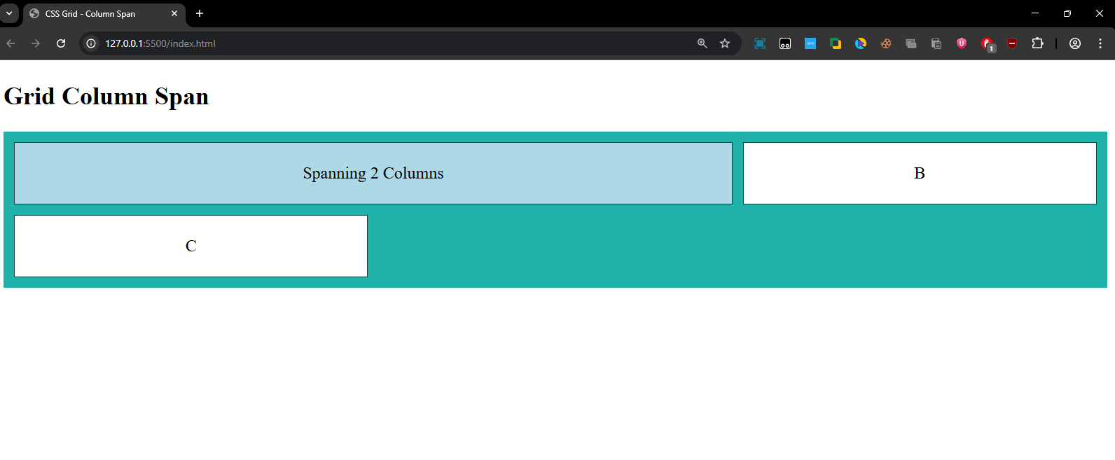
The first grid item will span across 2 columns, while the others remain in their respective columns.
2. grid-row
Defines how many rows an item should span. Similar to grid-column, it can be set using start and end, or the span keyword.
grid-row: start / end; /* Start and end are grid line numbers */
grid-row: span 2; /* Item will span across 2 rows */Example: Spanning Rows
<!DOCTYPE html>
<html lang="en">
<head>
<meta charset="UTF-8">
<meta name="viewport" content="width=device-width, initial-scale=1.0">
<title>CSS Grid - Row Span</title>
<style>
.grid-container {
display: grid;
grid-template-columns: 1fr 1fr 1fr;
gap: 10px;
background: lightcoral;
padding: 10px;
}
.grid-item {
background: white;
border: 1px solid #333;
padding: 20px;
text-align: center;
}
.span-rows {
grid-row: 1 / 3; /* Span across 2 rows */
background: lightpink;
}
</style>
</head>
<body>
<h2>Grid Row Span</h2>
<div class="grid-container">
<div class="grid-item span-rows">Spanning 2 Rows</div>
<div class="grid-item">B</div>
<div class="grid-item">C</div>
<div class="grid-item">D</div>
<div class="grid-item">E</div>
</div>
</body>
</html>Output:
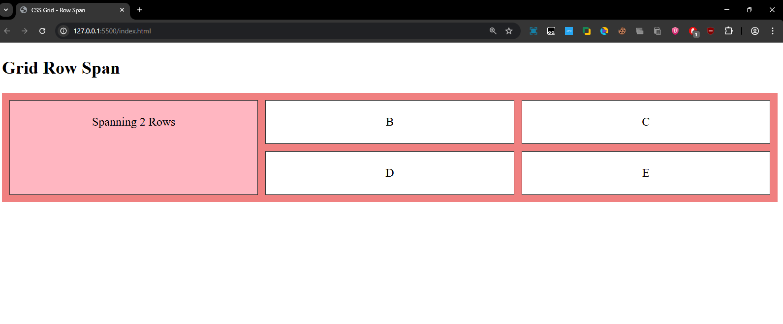
The first grid item will span across 2 rows, while the others are placed normally.
3. align-self and justify-self
These properties apply to individual grid items and allow you to align and justify them within their respective grid cells.
align-self: Controls the vertical alignment of a grid item within its grid cell (i.e., how far it is from the top or bottom of the cell).justify-self: Controls the horizontal alignment of a grid item within its grid cell (i.e., how far it is from the left or right of the cell).
align-self Values:
start— Aligns the item to the top of the grid cell.end— Aligns the item to the bottom of the grid cell.center— Aligns the item vertically at the center of the grid cell.stretch— Stretches the item to fill the height of the grid cell (this is the default).
justify-self Values:
start— Aligns the item to the left of the grid cell.end— Aligns the item to the right of the grid cell.center— Aligns the item horizontally at the center of the grid cell.stretch— Stretches the item to fill the width of the grid cell (this is the default).
Example:
<!DOCTYPE html>
<html lang="en">
<head>
<meta charset="UTF-8">
<meta name="viewport" content="width=device-width, initial-scale=1.0">
<title>CSS Grid - Align and Justify</title>
<style>
.grid-container {
display: grid;
grid-template-columns: 1fr 1fr 1fr;
gap: 10px;
background-color: lightgreen;
padding: 10px;
height: 300px;
}
.grid-item {
background-color: white;
border: 1px solid #333;
padding: 20px;
text-align: center;
}
.align-top {
align-self: start; /* Align item to the top */
}
.align-bottom {
align-self: end; /* Align item to the bottom */
}
.justify-left {
justify-self: start; /* Align item to the left */
}
.justify-center {
justify-self: center; /* Align item to the center */
}
</style>
</head>
<body>
<h2>Align and Justify Grid Items</h2>
<div class="grid-container">
<div class="grid-item align-top">Top</div>
<div class="grid-item align-bottom">Bottom</div>
<div class="grid-item justify-left">Left</div>
<div class="grid-item justify-center">Center</div>
</div>
</body>
</html>Output:
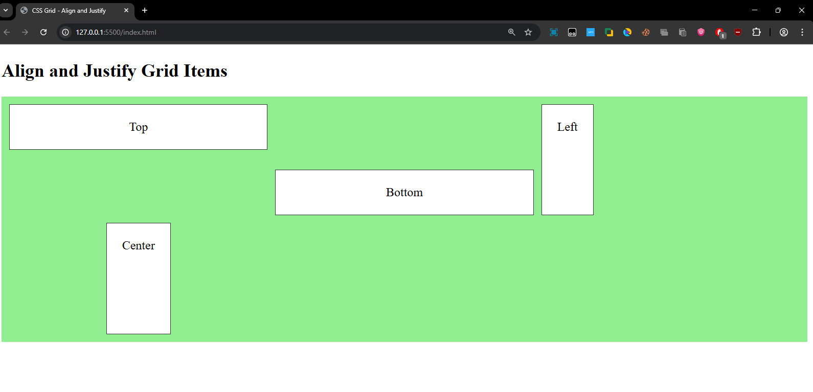
- The Top item is aligned at the top.
- The Bottom item is aligned at the bottom.
- The Left item is aligned to the left of its grid cell.
- The Center item is centered horizontally within its grid cell.
Grid vs Flexbox:
Grid and Flexbox are often confused because both are used for layout, but they have different strengths. Here’s a quick comparison:
| Feature | CSS Grid | Flexbox |
|---|---|---|
| Layout Type | Two-dimensional (rows and columns) | One-dimensional (either row or column) |
| Best For | Complex layouts (web pages, dashboards, etc.) | Simple layouts, alignment, and distribution of items |
| Control Over Rows | Full control over both rows and columns | No direct control over rows |
| Control Over Columns | Full control over both rows and columns | No direct control over columns |
| Alignment | Align items both horizontally and vertically | Align items only along a single axis |
| Ease of Use | Requires more planning (powerful but complex) | Simpler for quick layouts and one-dimensional tasks |
| Use Case | Web pages with header, footer, sidebar, content | Navigation bars, simple grid-like layouts |
Quick Recap:
Grid Container Properties:
grid-template-columnsandgrid-template-rows: Define the structure of the grid (how many columns/rows and their size).gap,row-gap, andcolumn-gap: Control the spacing between items in the grid.grid-template-areas: Allows you to define named grid sections, making it easy to position items visually.
Grid Item Properties:
grid-columnandgrid-row: Control how many columns/rows a grid item spans, and where it starts and ends.align-selfandjustify-self: Control the vertical and horizontal alignment of individual grid items.
When to Use Grid:
- CSS Grid is ideal for two-dimensional layouts where both rows and columns matter. It's perfect for structuring entire web pages, such as creating a header, footer, sidebar, and main content.
- Flexbox is more suited for one-dimensional layouts, where you only need to control alignment in a single row or column.