FlexBox
Flexbox (Flexible Box Layout) is a modern CSS layout module that makes it easier to design flexible and responsive layouts. It provides powerful alignment, spacing, and ordering features without relying on floats or positioning hacks.
To start using Flexbox, you need to set the container’s display to flex:
.container {
display: flex;
}- The container becomes a flex container.
- Its child elements are called flex items.
Flex Container Properties
These properties are applied to the parent container.
1. Flex Direction
Defines the direction of the flex items inside the container.
.flex-container {
display: flex;
flex-direction: row; /* default */
}Values:
row→ Left to right (default).row-reverse→ Right to left.column→ Top to bottom.column-reverse→ Bottom to top.
Example:
<!DOCTYPE html>
<html>
<head>
<style>
.flex-container {
display: flex;
flex-direction: row;
background-color: lightgray;
}
.flex-container div {
background: teal;
color: white;
padding: 20px;
margin: 5px;
}
</style>
</head>
<body>
<h2>Flex Direction Example</h2>
<div class="flex-container">
<div>One</div>
<div>Two</div>
<div>Three</div>
</div>
</body>
</html>Output:
Explanation:
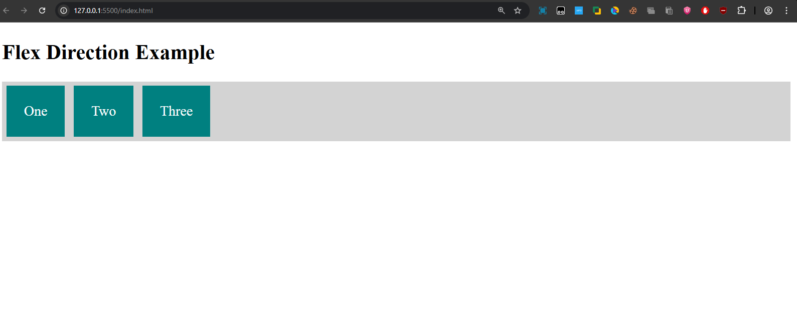
- The flex-container is set to display: flex and flex-direction: row, so the items will be displayed in a row from left to right.
- Output: Three items labeled "One", "Two", and "Three" appear in a horizontal row with equal spacing.
2. Flex Wrap
Controls whether items should wrap to the next line when space runs out.
.flex-container {
display: flex;
flex-wrap: wrap;
}Example:
<!DOCTYPE html>
<html>
<head>
<style>
.flex-container {
display: flex;
flex-wrap: wrap;
background: yellowgreen;
}
.flex-container div {
width: 200px;
margin: 10px;
background: tomato;
color: white;
text-align: center;
padding: 20px;
}
</style>
</head>
<body>
<h2>Flex Wrap Example</h2>
<div class="flex-container">
<div>1</div><div>2</div><div>3</div>
<div>4</div><div>5</div><div>6</div>
</div>
</body>
</html>Output:
Explanation: The items will break onto new lines as needed, with the last item appearing on a new row.
3. Justify Content
Aligns items along the main axis (horizontal if row, vertical if column).
justify-content: flex-start | flex-end | center | space-between | space-around | space-evenly;Example:
<!DOCTYPE html>
<html>
<head>
<style>
.flex-container {
display: flex;
justify-content: space-around;
background: lightblue;
}
.flex-container div {
padding: 20px;
background: purple;
color: white;
}
</style>
</head>
<body>
<h2>Justify Content Example</h2>
<div class="flex-container">
<div>A</div>
<div>B</div>
<div>C</div>
</div>
</body>
</html>Output:
Explanation:
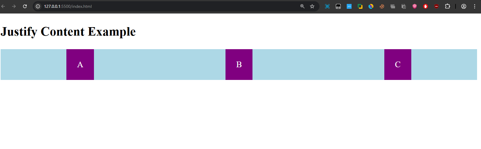
- The justify-content property is set to space-around, which distributes the items evenly with equal space before the first item, between each item, and after the last item.
- Output: Items "A", "B", and "C" are spaced out evenly along the main axis.
4. Align Items
Aligns items along the cross axis.
align-items: flex-start | flex-end | center | stretch | baseline;Example:
<!DOCTYPE html>
<html>
<head>
<style>
.flex-container {
display: flex;
align-items: center;
height: 200px;
background: peachpuff;
}
.flex-container div {
background: teal;
color: white;
padding: 15px;
margin: 5px;
}
</style>
</head>
<body>
<h2>Align Items Example</h2>
<div class="flex-container">
<div>One</div>
<div>Two</div>
<div>Three</div>
</div>
</body>
</html>Output:
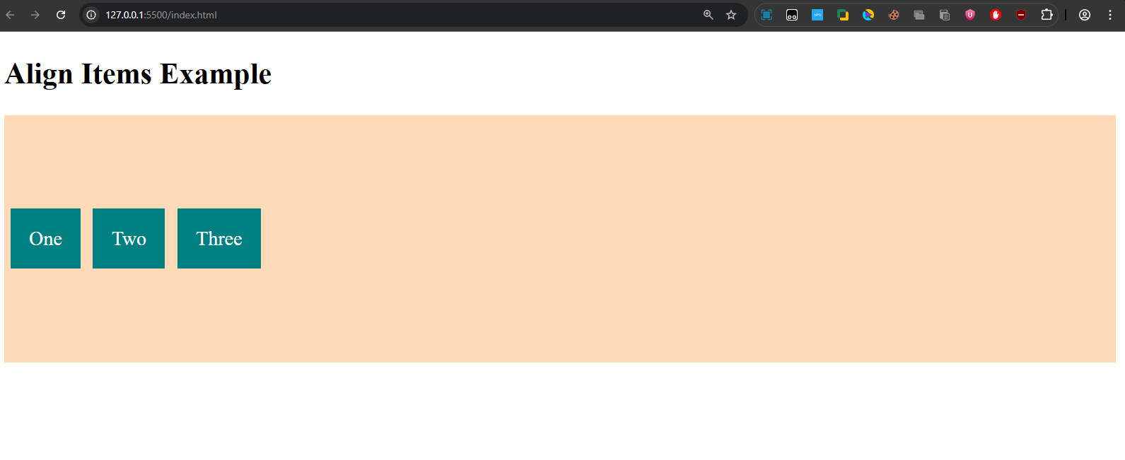
Explanation: Items "One", "Two", and "Three" are vertically centered inside the flex container.
5. Align Content
Aligns multiple lines of flex items (when wrapped).
align-content: flex-start | flex-end | center | space-between | space-around | stretch;Flex Item Properties
These properties are applied to the child elements (flex items).
1. Order
Defines the order of items inside the container. Default is 0.
Example:
<!DOCTYPE html>
<html>
<head>
<style>
.flex-container {
display: flex;
background: lightgray;
}
.flex-container div {
background: teal;
color: white;
padding: 20px;
margin: 5px;
}
.item1 { order: 3; }
.item2 { order: 1; }
.item3 { order: 2; }
</style>
</head>
<body>
<h2>Order Example</h2>
<div class="flex-container">
<div class="item1">One</div>
<div class="item2">Two</div>
<div class="item3">Three</div>
</div>
</body>
</html>Output:
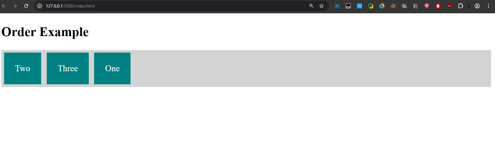
Explanation: Items will appear in the order "Two", "Three", "One".
2. Flex Grow & Shrink
Defines how items expand or shrink to fill available space.
flex-grow: 1;→ Item expands to fill space.flex-shrink: 1;→ Item shrinks if needed.
Example:
<!DOCTYPE html>
<html>
<head>
<style>
.flex-container {
display: flex;
background: beige;
}
.flex-container div {
padding: 20px;
margin: 5px;
background: steelblue;
color: white;
}
.item1 { flex-grow: 1; }
.item2 { flex-grow: 3; }
.item3 { flex-grow: 1; }
</style>
</head>
<body>
<h2>Flex Grow Example</h2>
<div class="flex-container">
<div class="item1">One</div>
<div class="item2">Two</div>
<div class="item3">Three</div>
</div>
</body>
</html>Output:
Explanation: The flex-grow property is used to allocate the remaining space. item2 will take up 3 times as much space as item1 and item3 since it has a flex-grow value of 3.
3. Align Self
Overrides align-items for individual items.
align-self: auto | flex-start | flex-end | center | baseline | stretch;Example:
<!DOCTYPE html>
<html>
<head>
<style>
.flex-container {
display: flex;
height: 200px;
background: lavender;
align-items: center;
}
.flex-container div {
background: orange;
color: white;
padding: 20px;
margin: 5px;
}
.item2 {
align-self: flex-end;
}
</style>
</head>
<body>
<h2>Align Self Example</h2>
<div class="flex-container">
<div>One</div>
<div class="item2">Two</div>
<div>Three</div>
</div>
</body>
</html>Output:
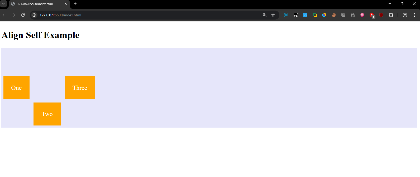
Explanation:
- The align-self property is applied to .item2 with the value flex-end, which overrides the default centering for just this item, aligning it to the bottom.
- "One" and "Three" are centered vertically, but "Two" is aligned at the bottom of the container.
Quick-Recap:
- Flexbox is an essential layout tool that simplifies responsive design.
- The flex-container properties (like flex-direction, justify-content, align-items, align-content, flex-wrap) are used to control the overall layout of the container.
- The flex-item properties (like order, flex-grow, align-self) help you control individual items within the container.
- With Flexbox, you can create layouts that adjust dynamically to the available space without needing complex calculations or hacks like floats.